![45 Best Google Fonts For Different Uses [2024 Update]](https://www.small-business-guide.com/wp-content/uploads/2024/11/fa82259addb5b7e9/best-google-fonts.png)
Google Fontsoffers a vast, free library of high-quality fonts designed to enhance website design, readability, and user experience.
From simple, clean sans-serifs like Roboto to elegant, classic serifs like Playfair Display, Google Fonts provides a range of versatile options suited to various design needs.
This selection of top Google Fonts covers body text, headings, branding, and storytelling, helping you find fonts that boost readability, reinforce brand identity, and improve site performance.
For blogs, e-commerce sites, portfolios, and more, these recommended fonts and suggested pairings allow for polished, user-friendly designs that resonate effectively with audiences.
Why Fonts Matter In Web Design
- Brandingand User Perception: Fonts establish a brand’s personality. For instance, Roboto’s clean, modern appearance suits techor digital brands, while Libre Baskervilleexudes elegance, fitting for luxury or editorial sites.
- Impact on UX and SEO: Typography directly affects usability and retention. Sans-serif fonts like Latoand Open Sansimprove readability on digital screens, reducing eye strain, while responsive fonts maintain clarity across devices.
- SEOand Performance Benefits: Readable fonts help reduce bounce rates, as users are more likely to stay engaged. Limiting font weights can optimize site speed, crucial for SEO.
Understanding Font Types And Terminology
- Serif Fonts: Traditional, elegant fonts like Merriweatherand Crimson Textwork well for body text and storytelling, adding a touch of sophistication.
- Sans-Serif Fonts: Clean, modern fonts like Robotoand Latoare commonly used for navigation and headers, enhancing readability on screens.
- Script Fonts: Flowing, decorative fonts like Pacificoadd personality and style to logos or titles but are best reserved for accents due to readability.
- Monospace Fonts: Uniform fonts like Inconsolataoffer a clean look for coding or technical documentation.
- Decorative Fonts: Bold fonts like Abril Fatfaceor Zilla Slabcreate impactful titles but should be used sparingly to avoid readability issues.
Quick Reference Table: Top Google Fonts For Websites
To simplify the selection process, here’s a quick reference guide to the best Google Fonts, categorized by their ideal uses. This table highlights the distinctive qualities of each font and provides icons to indicate optimal usage.
| Font Name | Style & Key Details |
| Roboto | Sans-Serif: Ideal for body text and navigation, Roboto is clean, modern, and highly readable. |
| Open Sans | Sans-Serif: Friendly and versatile, optimized for web use in body text. |
| Merriweather | Serif: Elegant and classic, optimized for screens, suitable for long-form content. |
| Montserrat | Sans-Serif: Geometric and bold, perfect for headings and logos with a modern urban style. |
| Playfair Display | Serif: Sophisticated with an 18th-century style, ideal for luxury branding. |
| Raleway | Sans-Serif: Sleek and minimalist, great for display text and logos. |
| Lora | Serif: Balanced, with calligraphic elegance, excellent for storytelling and body text. |
| Pupppins | Sans-Serif: Friendly with rounded edges, versatile for branding and headers. |
| Source Sans Pro | Sans-Serif: Adobe’s first open-source font, modern and ideal for clean body text. |
| Fira Sans | Sans-Serif: Neutral with clear readability, suitable for body text and branding. |
Related: 10 Best Google Penalty Checker Tools For SEO Recovery In <year>
Top 45 Google Fonts For Different Uses
Below are 45 of the best Google Fonts, categorized by use. Each font description highlights its unique qualities and ideal applications.
Best Fonts For Body Text
1. Roboto
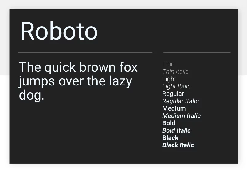
Style: Sans-Serif
Description: Roboto is a highly readable, modern sans-serif font, balancing geometric shapes with friendly curves. Its clarity makes it ideal for body text on digital platforms, and it adapts well to various screen sizes.
- Best Use: Blogs, articles, general body text.
- Suggested Pairing: Pairs well with Ralewayfor headers, creating a modern yet friendly combination.
2. Open Sans
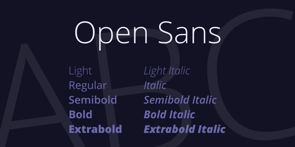
Style: Sans-Serif
Description: Designed for readability across devices, Open Sans has an open, neutral style that feels approachable and professional. Its consistent letter spacing makes it ideal for body text, especially on mobile devices.
- Best Use: Mobile-friendly body text, versatile for both small and large websites.
- Suggested Pairing: Complements Loraor Playfair Displayfor headers, adding a modern-classic contrast.
3. Merriweather
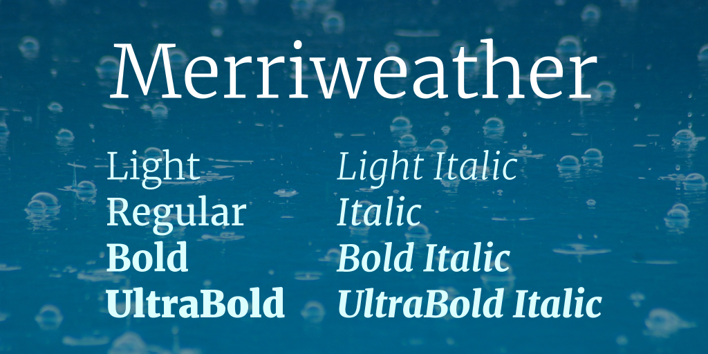
Style: Serif
Description: With classic, slightly condensed letterforms, Merriweather is designed for comfortable reading on screens, especially in long-form content. Its timeless serif style gives it a literary feel.
- Best Use: Long articles, news sites, storytelling websites.
- Suggested Pairing: Works beautifully with Montserratfor headings, combining classic and contemporary styles.
4. Lato
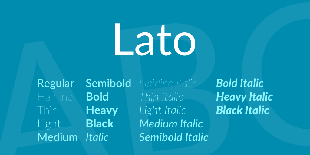
Style: Sans-Serif
Description: Lato’s rounded, warm letters offer a friendly appearance while remaining professional. Its readability and approachable tone make it versatile for body text or general website use.
- Best Use: General body text, businesssites, lifestyle blogs.
- Suggested Pairing: Pair with Merriweatherfor headers to add a traditional touch.
5. Source Sans Pro
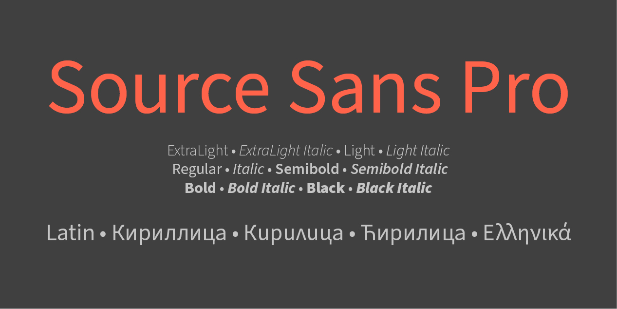
Style: Sans-Serif
Description: As Adobe’s first open-source font, Source Sans Pro has clean, consistent lines that adapt well to various text sizes. It’s optimized for readability and offers a sleek, contemporary look.
- Best Use: Body text, tech websites, minimalistic designs.
- Suggested Pairing: Works well with Playfair Displayor Roboto Slabfor contrast.
6. Nunito
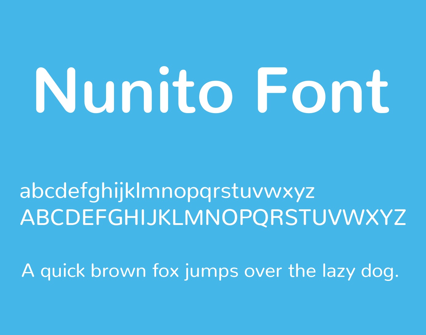
Style: Sans-Serif
Description: Nunito offers a balanced, rounded design, making it both approachable and highly legible. Its gentle curves and friendly appearance make it ideal for body text, particularly on educational or lifestyle websites.
- Best Use: Educational websites, lifestyle blogs, mobile-friendly designs.
- Suggested Pairing: Works well with Merriweatherfor headers, adding a traditional touch to the modern look.
7. Spectral
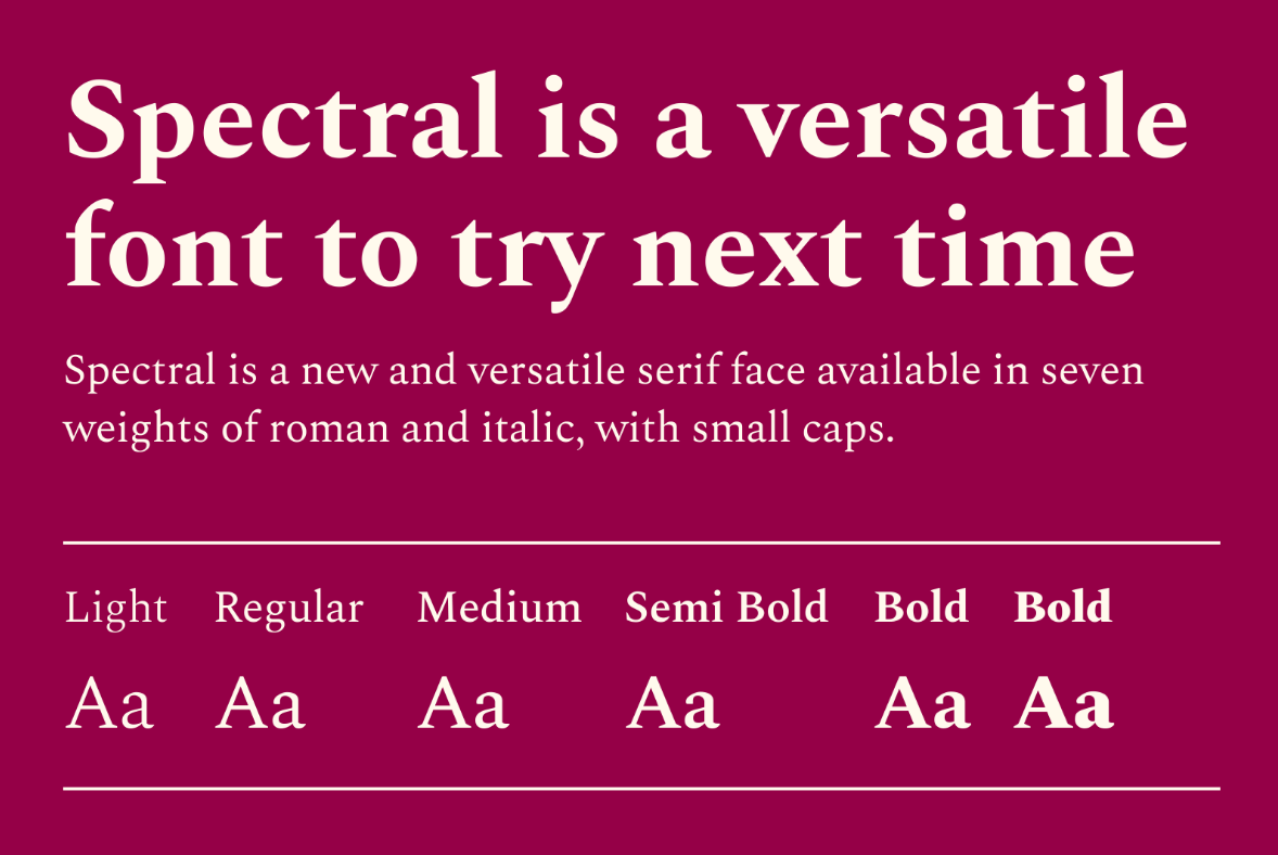
Style: Serif
Description: Spectral is a versatile serif font with a modern touch, designed for high readability in long-form content. Its elegant yet contemporary look makes it perfect for editorial sites or blogs that focus on storytelling.
- Best Use: Long-form articles, editorial content, blog posts.
- Suggested Pairing: Pairs nicely with Robotofor a sophisticated yet simple body text pairing.
See Also: How Google Evaluates Your Content - Key Factors To Rank Higher
8. Alegreya
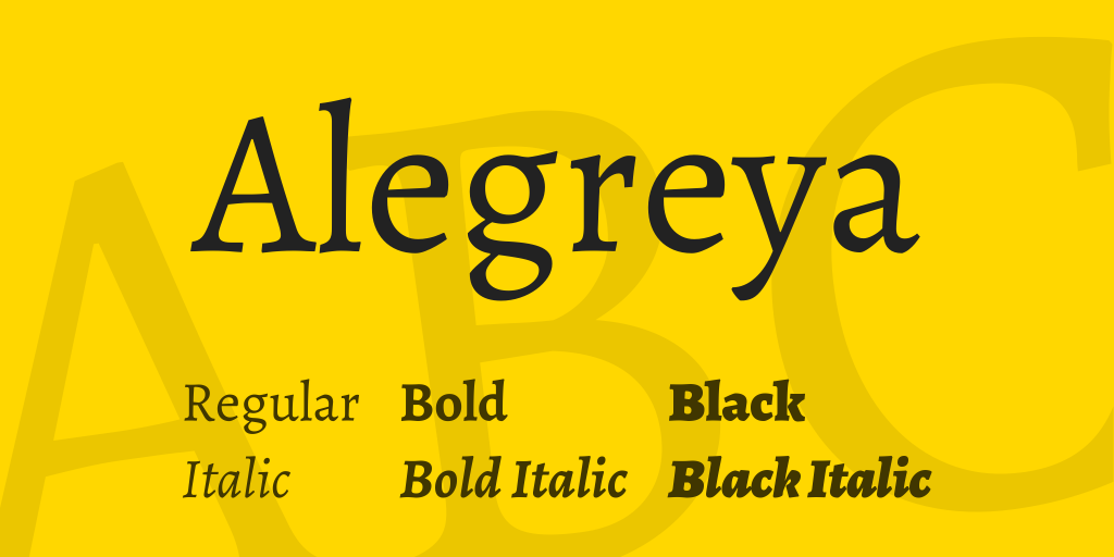
Style: Serif
Description: Originally designed for literature, Alegreya combines readability with personality. Its unique style is excellent for storytelling and longer pieces of content, offering a humanistic touch to your text.
- Best Use: Storytelling, literary websites, long-form articles.
- Suggested Pairing: Pairs well with Open Sansfor a clean, readable combination that balances traditional and modern elements.
9. Noto Sans
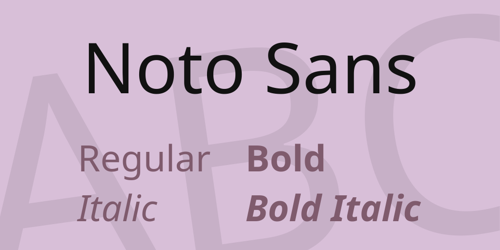
Style: Sans-Serif
Description: Noto Sans supports multiple languages, making it a perfect choice for multilingual websites. Its simple, clean design enhances readability, ensuring consistency across diverse content.
- Best Use: Multilingual websites, tech websites, universal design.
- Suggested Pairing: Complements PT Seriffor headers to create a balanced, readable combination.
10. PT Serif
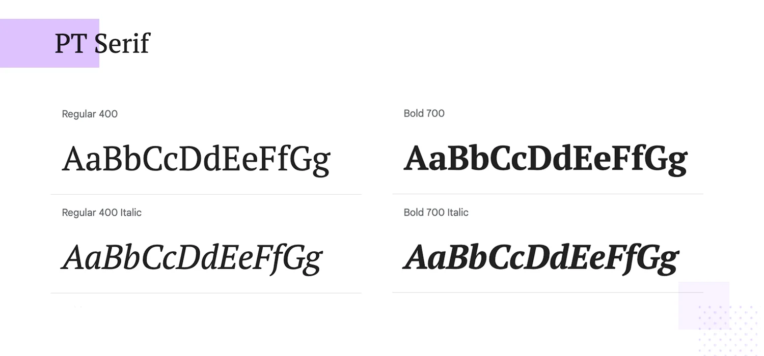
Style: Serif
Description: PT Serif offers a classic serif look with strong readability, making it ideal for text-heavy pages. Its versatile design works well in both digital and print applications.
- Best Use: News websites, academic blogs, professional publications.
- Suggested Pairing: Works beautifully with Robotofor a clean, modern pairing.
Best Fonts For Headings And Display Text
11. Montserrat
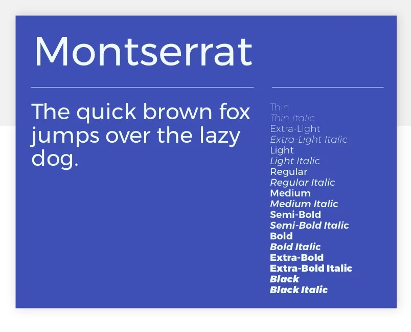
Style: Sans-Serif
Description: Inspired by urban signage, Montserrat is bold and geometric, with a distinctive style that adds personality to headings and titles. Its modern look makes it a popular choice for contemporary websites.
- Best Use: Headers, logos, and branding elements.
- Suggested Pairing: Works well with Robotoor Merriweatherfor body text, adding a bold contrast to simpler fonts.
12. Oswald
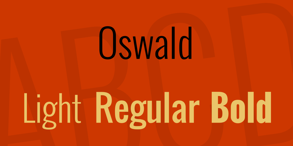
Style: Sans-Serif
Description: Oswald’s condensed letterforms offer a strong, authoritative tone, making it perfect for impactful headers. Originally inspired by classic gothic typefaces, it brings a timeless appeal.
- Best Use: Headers, buttons, call-to-action elements.
- Suggested Pairing: Pairs well with Open Sansor Lorafor a balanced layout.
13. Playfair Display
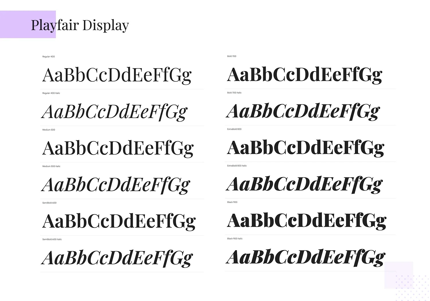
Style: Serif
Description: With roots in 18th-century European typography, Playfair Display exudes sophistication and elegance. Its high-contrast style makes it ideal for upscale branding and stylish headers.
- Best Use: Editorial sites, luxury brands, headers.
- Suggested Pairing: Complements Source Sans Proor Robotofor a refined look that combines elegance and simplicity.
14. Raleway
Style: Sans-Serif
Description: Raleway is sleek and minimalist, designed to make a polished, professional statement in large text. Its clean lines and modern structure make it ideal for headlines and display purposes.
- Best Use: Headers, large display text, logos.
- Suggested Pairing: Works well with Latoor Crimson Textfor a dynamic mix of modern and classic.
15. Abril Fatface
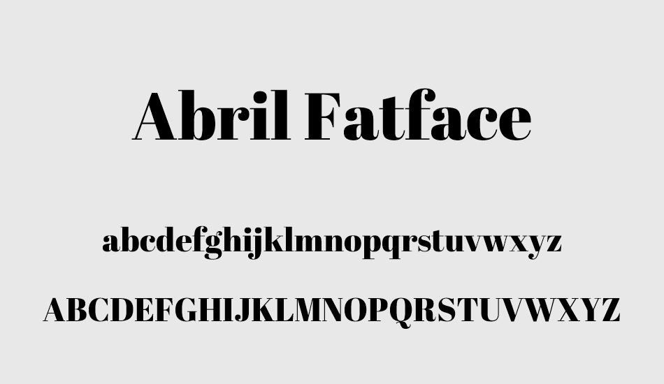
Style: Serif
Description: Abril Fatface is a high-contrast, bold font that’s perfect for impactful titles and display text. Its dramatic style adds a stylish, dynamic touch to designs, making it a standout choice for editorial or fashion sites.
- Best Use: Titles, headers, magazine layouts.
- Suggested Pairing: Complements Latoor Open Sansfor body text, adding contrast to a clean layout.
16. Teko
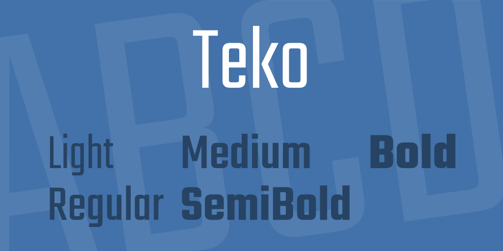
Style: Sans-Serif
Description: Teko features tall, narrow letterforms that are highly effective in headers, especially where space is limited. Its bold, structured design is ideal for high-impact displays, like sports or news sites.
- Best Use: Headers, banners, call-to-action elements.
- Suggested Pairing: Pairs well with Robotoor Nunitofor a professional, balanced layout.
17. Zilla Slab
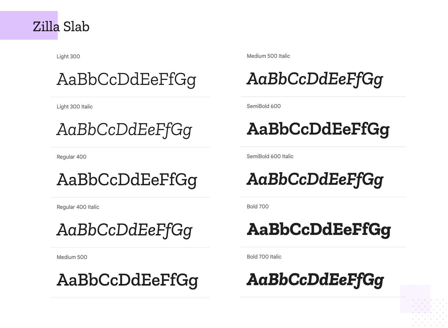
Style: Slab-Serif
Description: Zilla Slab is a bold yet highly readable font, balancing robustness with elegance. Its slab-serif style makes it perfect for titles on content-focused sites, adding a professional yet approachable tone.
- Best Use: Titles, blog headers, display text.
- Suggested Pairing: Complements Latoor Source Sans Profor a balanced and readable design.
18. Josefin Sans
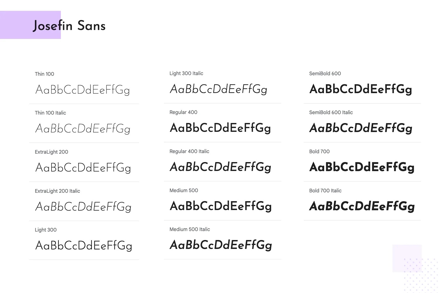
Style: Sans-Serif
Description: Josefin Sans brings a unique vintage charm to headings and display text. With its geometric design, this font adds character and personality, making it perfect for creative or artistic websites.
- Best Use: Headers, titles, logos with a retro touch.
- Suggested Pairing: Pairs well with Playfair Displayor Lorato combine creativity with sophistication.
19. Amatic SC
Style: Handwritten, Sans-Serif
Description: Amatic SC’s hand-drawn, playful style is ideal for artistic and informal headers, adding a creative, personal touch to designs. It’s highly effective for adding personality in small doses.
- Best Use: Artistic websites, creative titles, informal headers.
- Suggested Pairing: Complements Robotoor Nunitofor a playful yet readable combination.
20. Roboto Slab
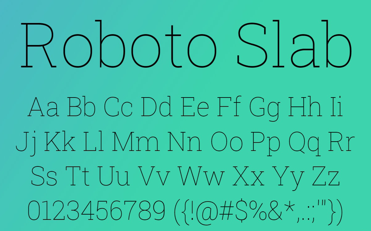
Style: Slab-Serif
Description: The slab-serif version of Roboto, this font adds weight and structure to headers while retaining a modern aesthetic. Its solid design is ideal for adding a subtle touch of authority to headers.
- Best Use: Headers, titles, structured layouts.
- Suggested Pairing: Works well with Robotoor Open Sansfor body text, maintaining a cohesive look.
You Might Like: 5 Proven Ways To Increase Your Google Rankings
Best Fonts For Branding And Logos
21. Poppins
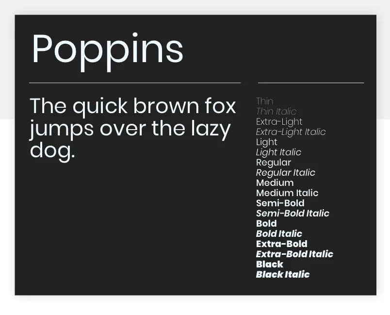
Style: Sans-Serif
Description: With its geometric design and rounded edges, Poppins is a friendly and highly readable font, ideal for versatile branding applications.
- Best Use: Logos, branding elements, headers.
- Suggested Pairing: Combine with Merriweatheror Playfair Displayto create a balanced, approachable look.
22. Rubik
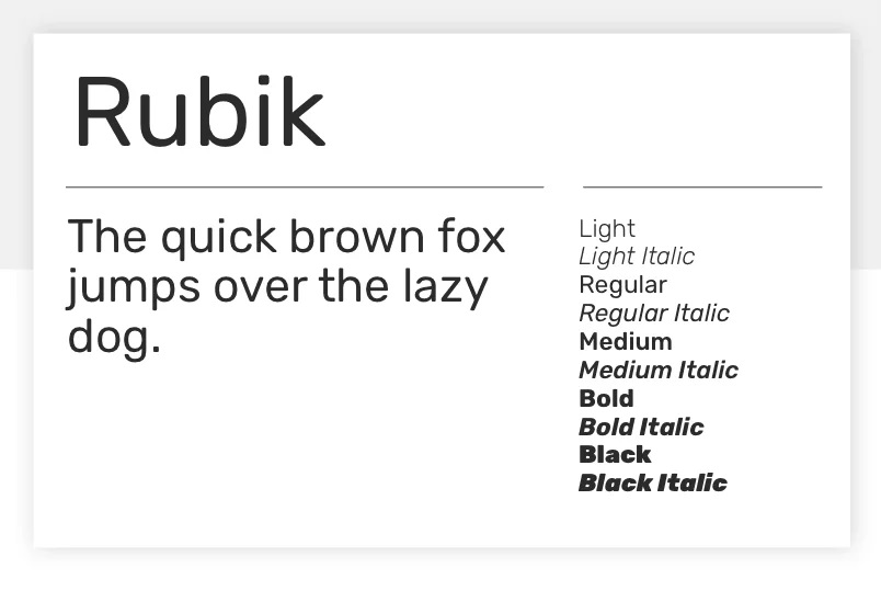
Style: Sans-Serif
Description: Rubik’s rounded corners and clean lines give it a friendly, adaptable feel. It’s particularly useful for brands that want a fresh, modern appearance.
- Best Use: Logos, tech or lifestyle branding, versatile display use.
- Suggested Pairing: Works well with Nunitoor Open Sansfor clean, harmonious layouts.
23. Syne
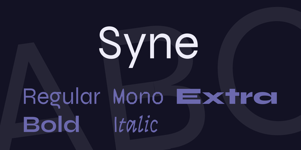
Style: Display, Sans-Serif
Description: With unconventional shapes, Syne makes a statement in branding. It’s a unique choice for brands looking to stand out with personality and creativity.
- Best Use: Logos, branding, artistic titles.
- Suggested Pairing: Complements Robotoor Lorafor a balanced mix of unique and traditional.
24. Fira Sans
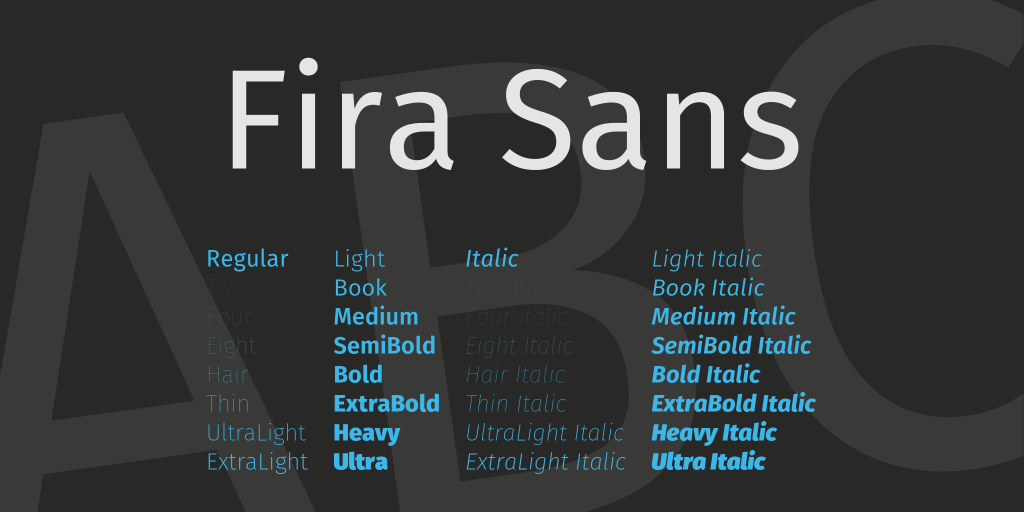
Style: Sans-Serif
Description: Originally designed for Mozilla, Fira Sans offers a clean and contemporary look, making it suitable for tech or professional branding.
- Best Use: Digital branding, body text on tech sites.
- Suggested Pairing: Pairs well with Merriweatherfor headers, adding contrast and readability.
25. Libre Baskerville
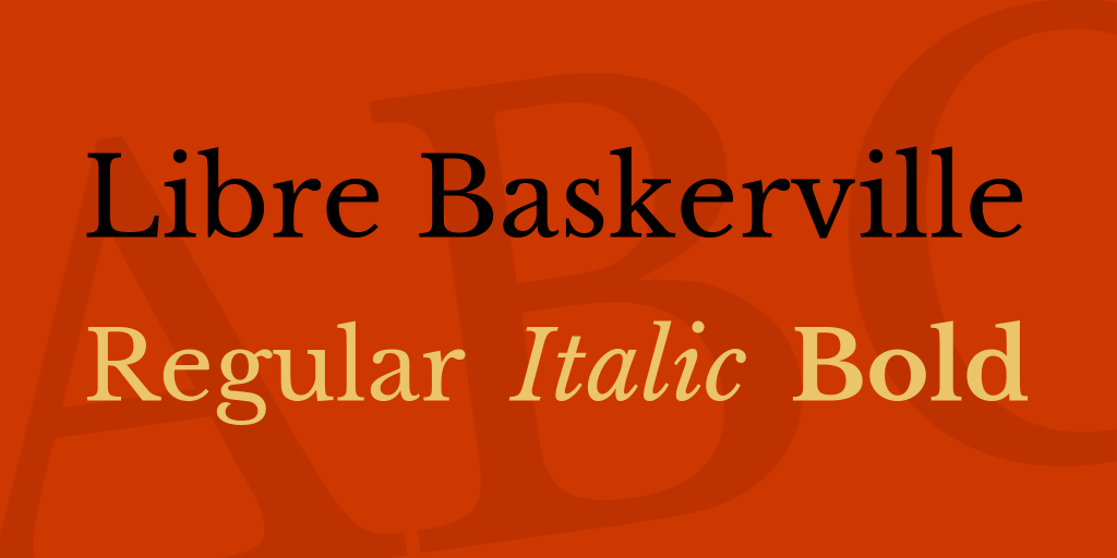
Style: Serif
Description: This classic serif font brings sophistication and readability, making it ideal for brands that need an authoritative yet approachable style.
- Best Use: Logos, luxury brands, traditional headers.
- Suggested Pairing: Works beautifully with Robotoor Latofor a polished look.
26. Karla
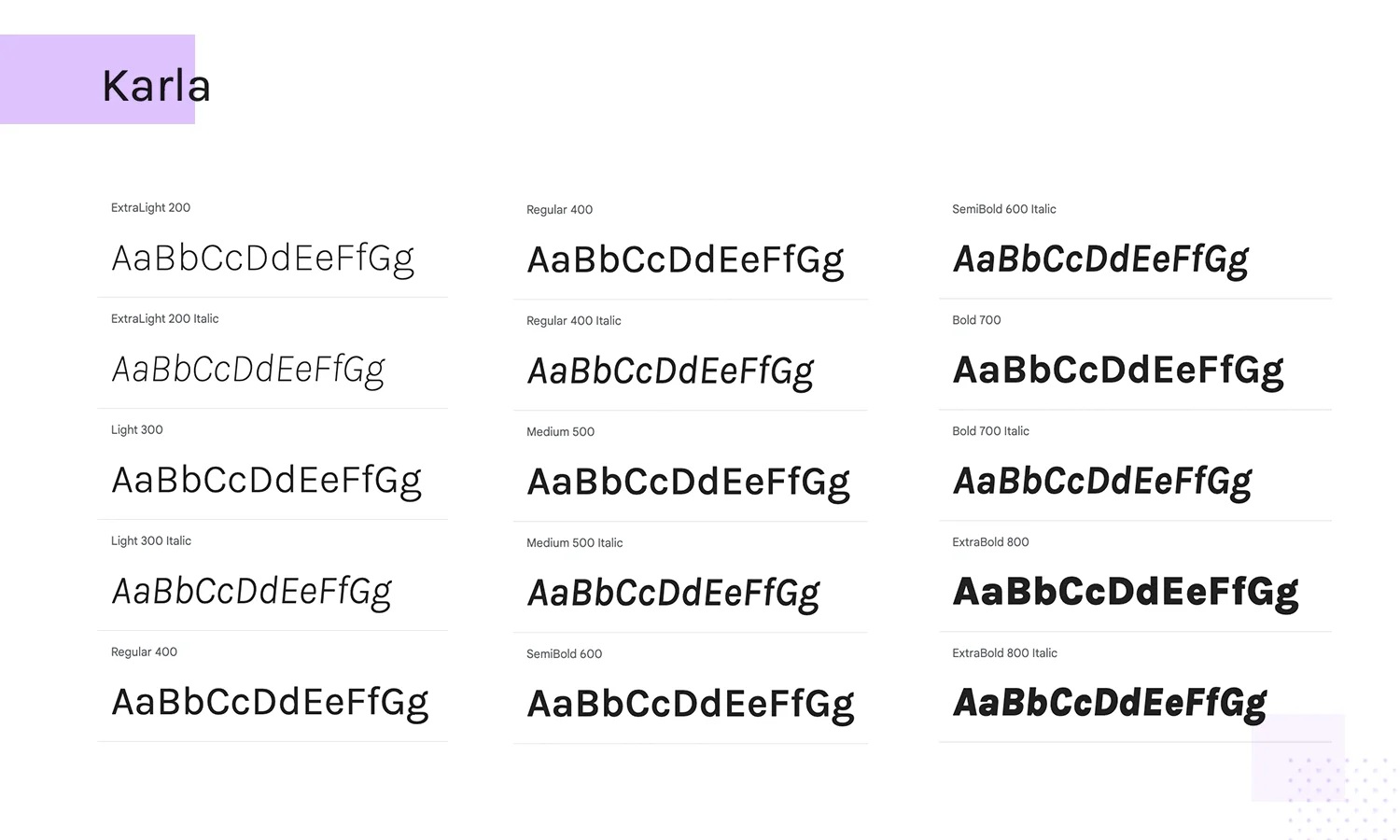
Style: Sans-Serif
Description: Karla is a clean, minimalist font that performs well in diverse brand contexts, from tech startups to lifestyle brands. Its simple, approachable design makes it versatile and adaptable.
- Best Use: Branding, tech websites, lifestyle brands.
- Suggested Pairing: Works beautifully with Merriweatheror Lorafor a refined, modern-traditional blend.
27. Manrope
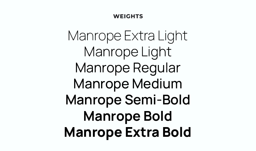
Style: Sans-Serif, Variable Font
Description: Manrope is a modern, variable font with a refined simplicity. It’s designed to be elegant and versatile, making it ideal for brands seeking a contemporary and polished look.
- Best Use: Sophisticated branding, minimalist websites, professional applications.
- Suggested Pairing: Pairs well with Playfair Displayor Crimson Textfor a sophisticated and elegant combination.
28. BioRhyme
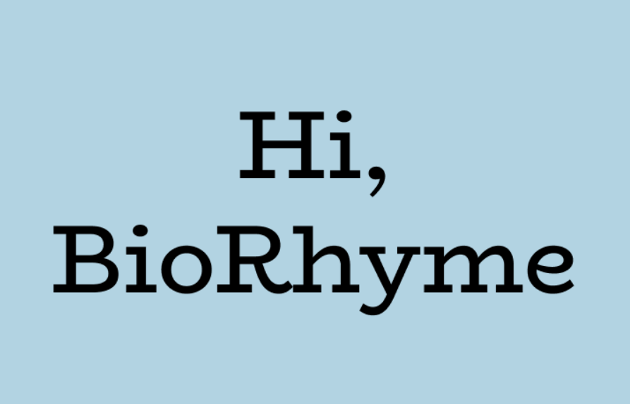
Style: Serif
Description: BioRhyme has an open, distinct design that brings a friendly and approachable personality to brand identities. Its strong, playful style works well for creative and welcoming brands.
- Best Use: Logos, lifestyle brands, creative branding.
- Suggested Pairing: Complements Robotoor Nunitoto create a blend of playfulness and readability.
29. Caladea
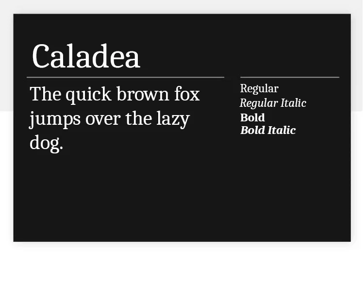
Style: Serif
Description: Caladea combines a classic serif structure with a modern flair, making it suitable for sophisticated branding. Its balanced, stylish look fits well with brands needing a touch of elegance.
- Best Use: Logos, luxury branding, sophisticated websites.
- Suggested Pairing: Works well with Open Sansor Latofor body text, adding elegance to simplicity.
30. Brawler
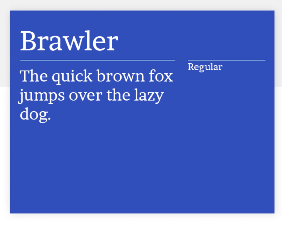
Style: Serif
Description: Originally designed for newspapers, Brawler has a strong, old-school appearance that adds a touch of tradition and elegance to brand designs. Its classic style is perfect for brands that value heritage.
- Best Use: Heritage branding, logos, traditional designs.
- Suggested Pairing: Complements Loraor Nunitofor a balanced look that mixes traditional and contemporary.
Best Fonts For Storytelling And Long-Form Content
31. Lora
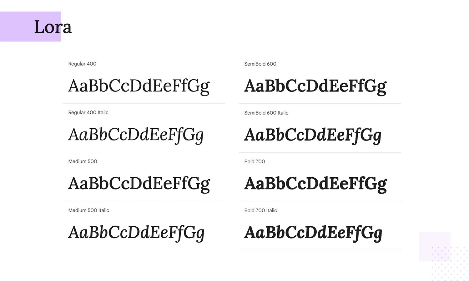
Style: Serif
Description: Lora’s brush-inspired curves provide an elegant, sophisticated touch, making it ideal for immersive, storytelling-focused websites.
- Best Use: Long-form content, editorial articles, storytelling.
- Suggested Pairing: Complements Open Sansor Nunitofor a harmonious layout.
32. Cormorant
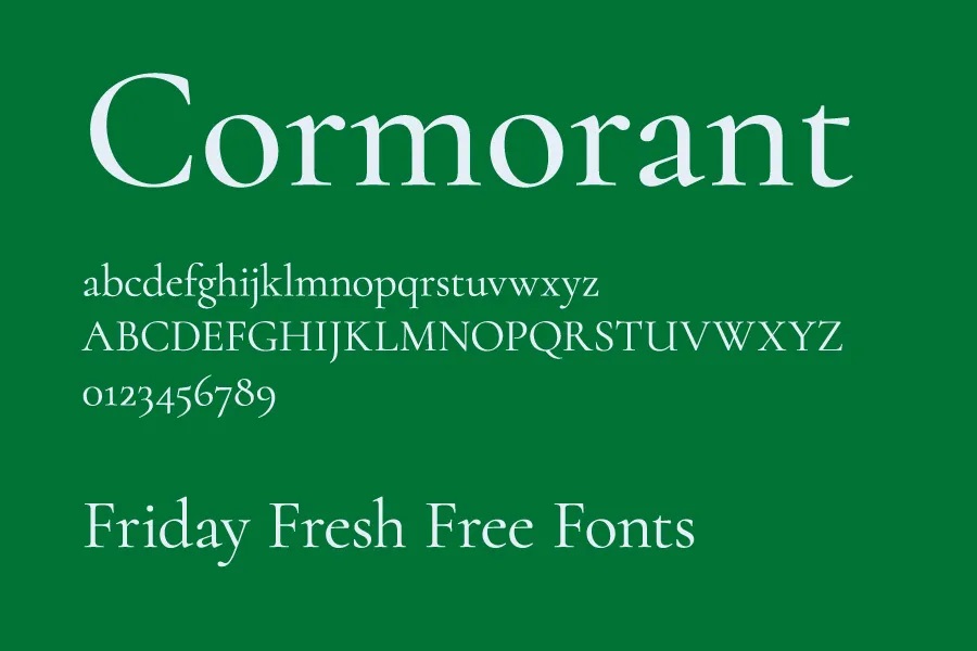
Style: Serif
Description: Combining classic style with high readability, Cormorant brings elegance to editorial or literary content. Its unique forms lend an old-world feel.
- Best Use: Editorial content, lifestyle blogs, bookish websites.
- Suggested Pairing: Pairs well with Latofor a mix of traditional and modern elements.
33. Fraunces
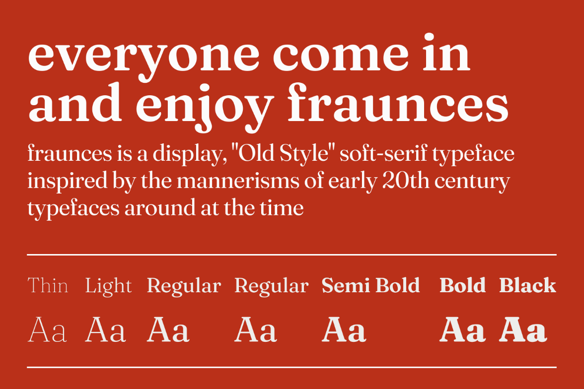
Style: Display, Serif
Description: Fraunces adds a retro flair with its expressive design, making it suitable for lifestyle and storytelling websites seeking a unique, vintage touch.
- Best Use: Lifestyle blogs, editorial sites, headers.
- Suggested Pairing: Complements Open Sansfor a vibrant, engaging design.
34. Neuton
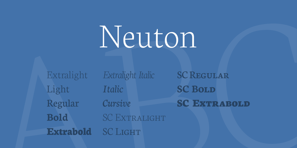
Style: Serif
Description: Neuton is a highly readable serif font, designed to provide comfort and style for extended reading sessions. Its legibility and classic structure make it perfect for lengthy content.
- Best Use: Long articles, academic content, editorial sites.
- Suggested Pairing: Pairs well with Latoor Open Sansfor headers, creating a clean and approachable contrast.
35. Cardo
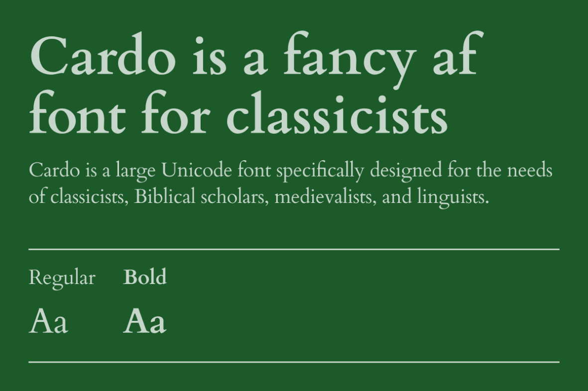
Style: Serif
Description: Inspired by historic letterforms, Cardo is ideal for historical or classical narratives. Its unique design adds depth and tradition, making it perfect for culturally rich content.
- Best Use: Historical articles, academic sites, classical narratives.
- Suggested Pairing: Complements Loraor Merriweatherto create a timeless, scholarly feel.
36. Inknut Antiqua
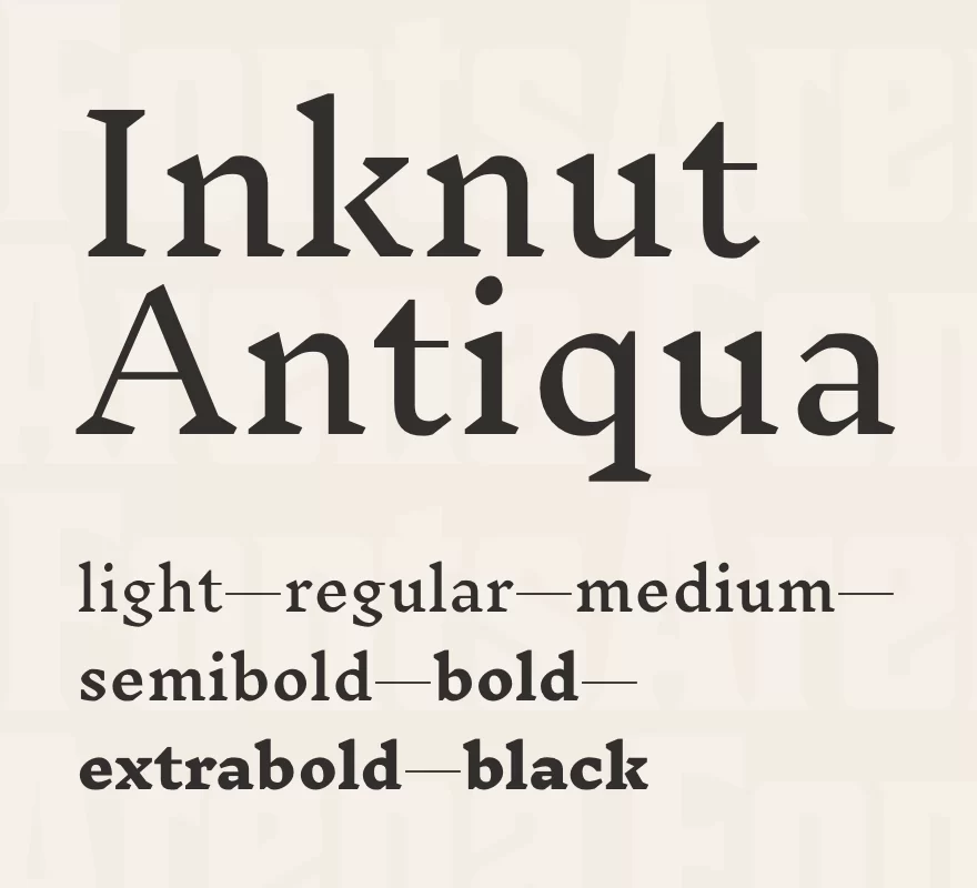
Style: Serif
Description: With roots in ancient typography, Inknut Antiqua adds a distinct character to storytelling content. It’s especially effective for cultural, historical, or academic sites, giving text a rich, vintage touch.
- Best Use: Cultural sites, academic writing, storytelling.
- Suggested Pairing: Works well with Robotoor Open Sansto balance traditional and modern elements.
37. Maitree
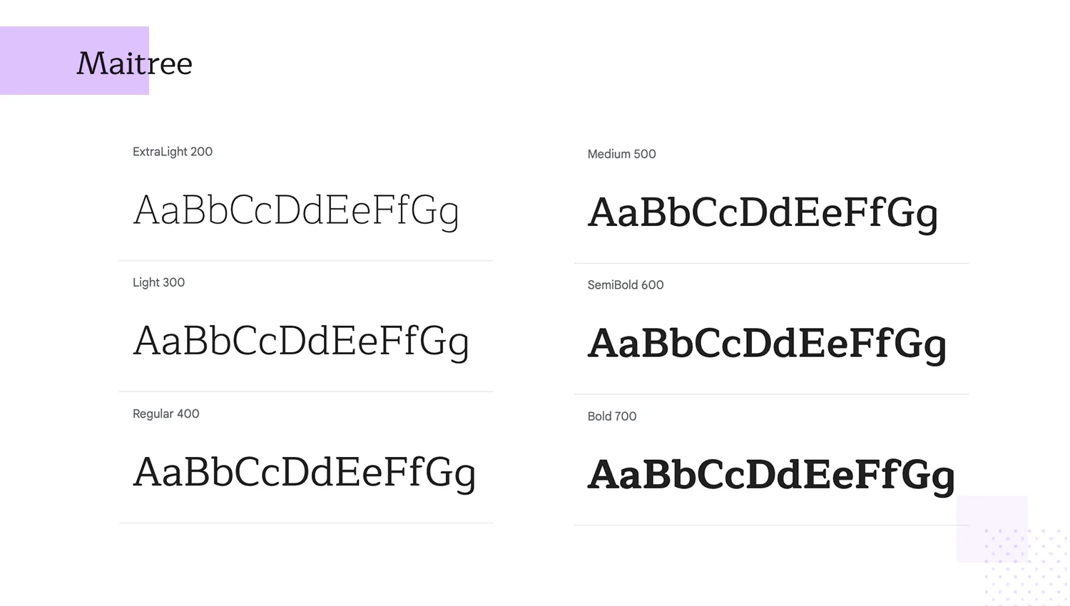
Style: Serif
Description: Merging traditional Thai and Latin elements, Maitree offers a unique blend of cultural influence and readability. It’s an excellent choice for bilingual content, adding a subtle but distinctive character.
- Best Use: Bilingual content, cultural storytelling, international websites.
- Suggested Pairing: Complements Nunitoor Lorafor a harmonious, multicultural design.
38. Gelasio
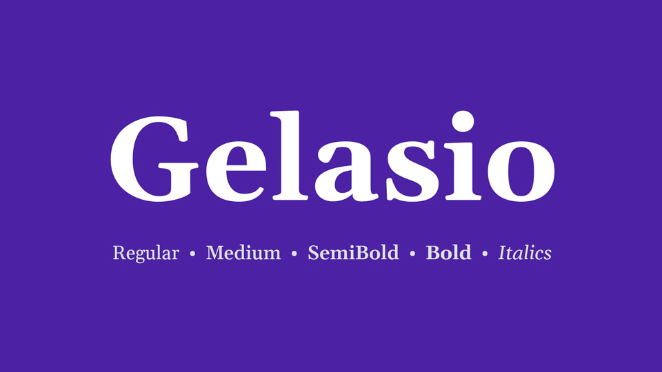
Style: Serif
Description: Gelasio combines modern variations on classic forms, providing both readability and style. It’s particularly suitable for long-form narratives, adding elegance without sacrificing clarity.
- Best Use: Long articles, blogs, narrative-driven content.
- Suggested Pairing: Works well with Open Sansor Latofor body text, enhancing readability with a touch of sophistication.
39. Nanum Gothic
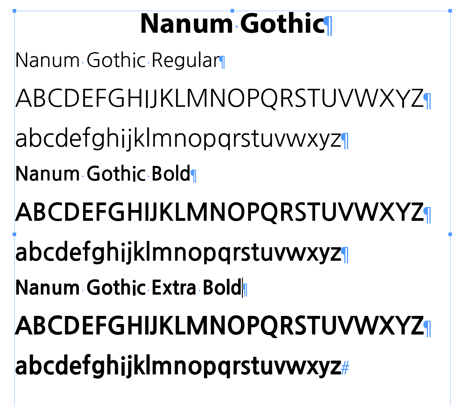
Style: Sans-Serif
Description: Nanum Gothic is a versatile font supporting both Korean and Latin characters, making it ideal for multilingual storytelling. Its clean, approachable design ensures readability across languages.
- Best Use: Multilingual websites, international content, tech and academic sites.
- Suggested Pairing: Complements Robotoor Lorafor a blend of simplicity and elegance.
40. Enriqueta
Style: Serif
Description: Enriqueta is a bold, balanced serif font, designed for readability on content-heavy websites. Its sturdy structure and clarity make it ideal for both screen and print applications.
- Best Use: Blogs, news websites, content-heavy pages.
- Suggested Pairing: Pairs well with Nunitoor Latofor a clean, professional appearance.
41. Domine
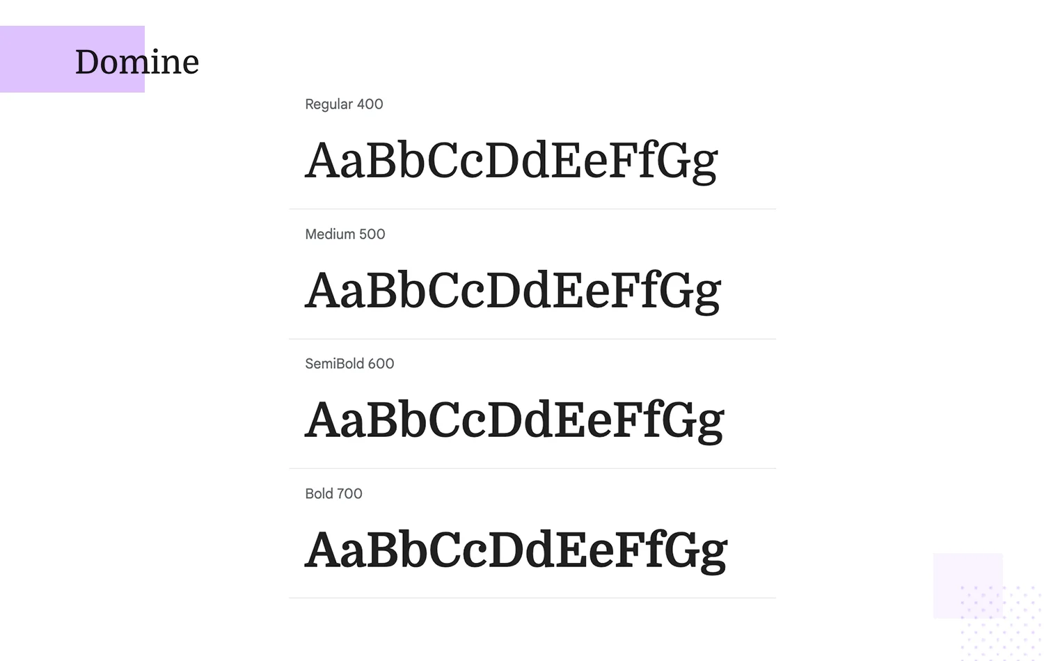
Style: Serif
Description: Designed specifically for screen readability, Domine provides comfort for readers in long-form content. Its straightforward design offers a traditional look that works well on digital devices.
- Best Use: Long-form content, news sites, article-focused pages.
- Suggested Pairing: Complements Open Sansor Robotofor body text, creating a harmonious and legible layout.
Additional Fonts For Versatile Use Cases
42. Roboto Mono
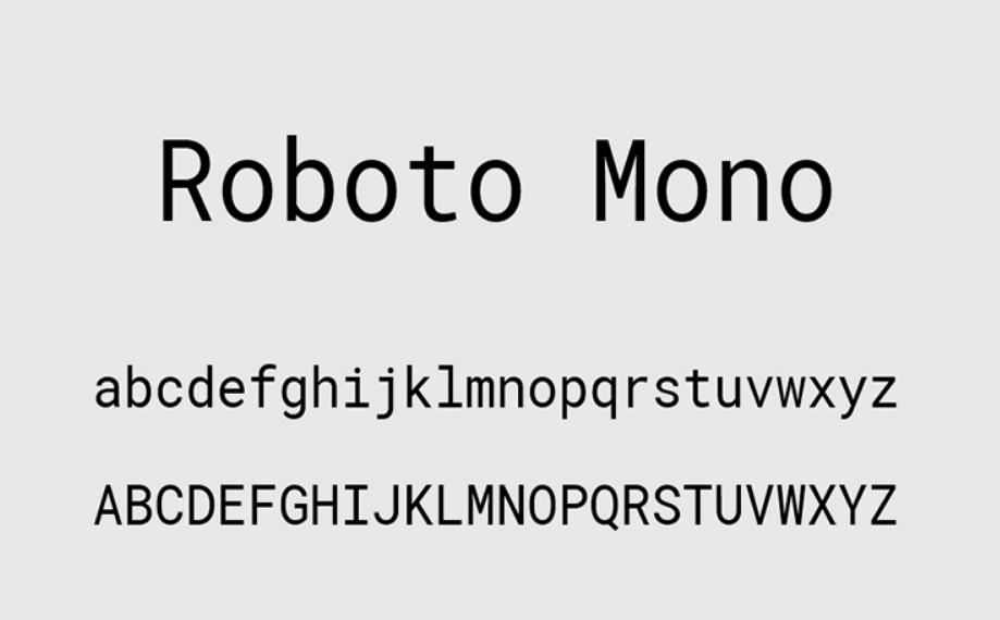
Style: Monospace
Description: Roboto Mono is a clean and highly readable monospace font, making it ideal for coding and technical websites. Its uniform letter spacing enhances readability, particularly in programming displays or technical documentation.
- Best Use: Coding displays, technical websites, programming documentation.
- Suggested Pairing: Complements Robotofor a cohesive, structured look across technical content.
43. Crimson Text
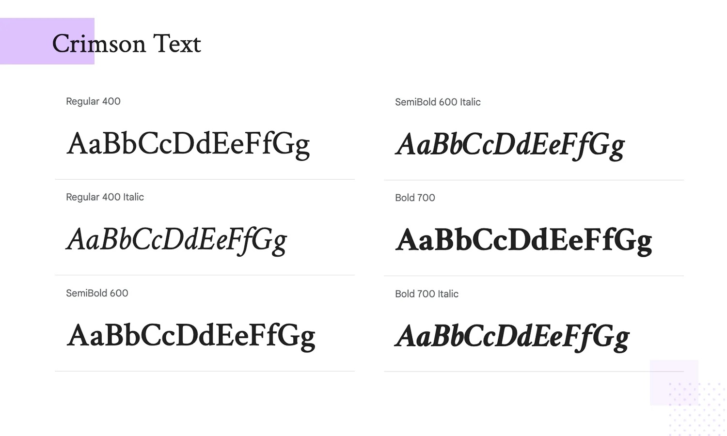
Style: Serif
Description: Crimson Text is a beautiful serif inspired by old-style typefaces, adding a classic feel to both print and digital content. Its elegant design is perfect for long-form reading and storytelling.
- Best Use: Classic storytelling, print-inspired digital content, blogs.
- Suggested Pairing: Pairs well with Open Sansor Latoto balance a traditional and modern look.
44. Muli
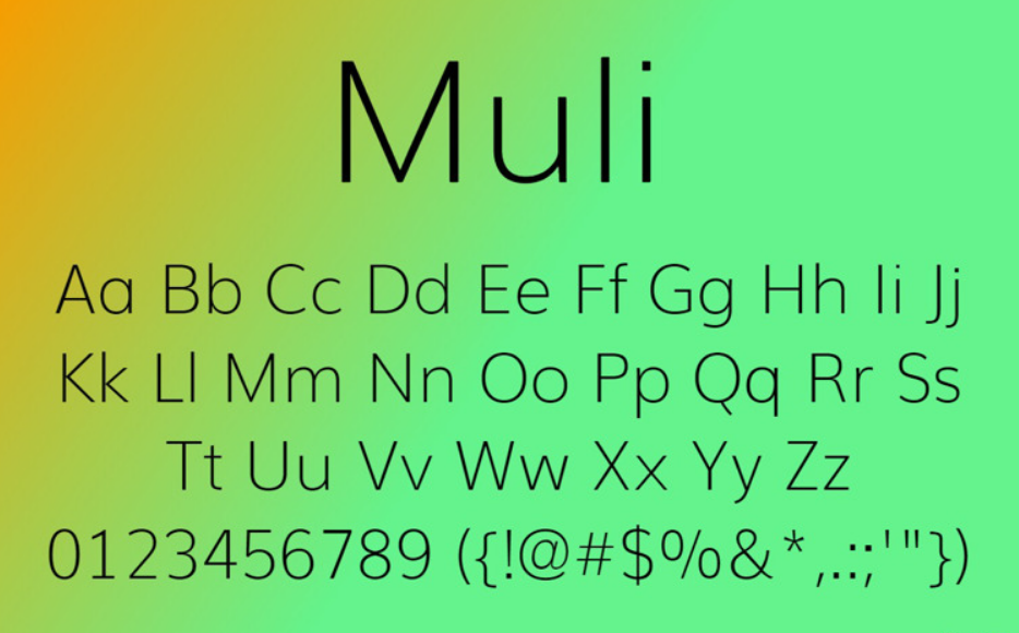
Style: Sans-Serif
Description: Muli is a minimalist, sans-serif font adaptable to both display and body text. Its clean and straightforward design makes it versatile for various design needs, especially where simplicity is key.
- Best Use: General body text, modern minimalist designs, tech websites.
- Suggested Pairing: Complements Merriweatheror Playfair Displayfor a clean, polished layout.
45. Ubuntu
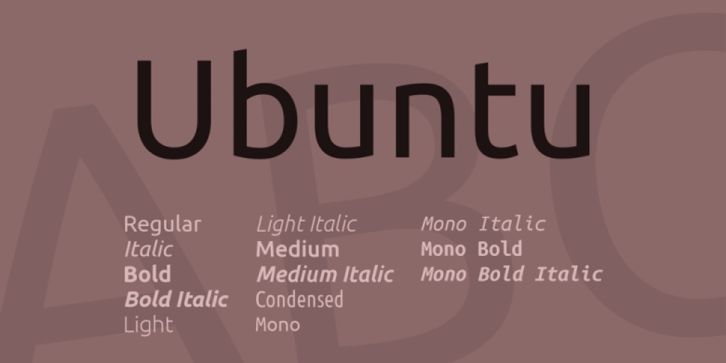
Style: Sans-Serif
Description: Ubuntu’s rounded letterforms and friendly appearance make it ideal for tech-related content, especially on sites linked to open-source projects. It’s approachable yet professional, conveying a sense of modernity and accessibility.
- Best Use: Tech sites, open-source projects, digital platforms.
- Suggested Pairing: Pairs well with Loraor Robotofor a harmonious, user-friendly design.
Also Read: How To Use Google Search Console Correctly - Tips And Tricks
FAQs About Google Fonts
To address common questions, here is a helpful FAQ section. Each question includes a brief answer to provide clarity on some of the more technical or practical aspects of Google Fonts.
Are Google Fonts Free To Use?
Yes, Google Fonts are free for both personal and commercial use. They are open-source and come with licensing that allows you to use them in any project without additional costs.
How Do I Pair Google Fonts Effectively?
Pairing fonts can be challenging, but a good rule of thumb is to choose one serif font and one sans-serif font. Tools like Google Fonts’ built-in pairings and websites like Font Pair offer suggestions to help you find balanced, visually appealing combinations.
What’s The Best Way To Add Google Fonts To My WordPress Site?
You can use plugins like Easy Google Fonts or Google Fonts Typography for easy font management in WordPress. Alternatively, you can embed the Google Fonts API or download and host fonts locally for more control over performance.
Do Google Fonts Affect My Website’s Loading Speed?
Yes, loading multiple fonts or too many font weights can impact load speed. To optimize performance, limit the number of fonts and font weights, or consider using variable fonts. Hosting fonts locally can also improve loading times.
Can I Use Google Fonts For Print Projects?
Yes, Google Fonts are available for both web and print use. You can download the font files from the Google Fonts website and use them in any design software for print projects.
Conclusion
Google Fonts offers a wide selection of high-quality typefaces that can elevate any web design. By selecting fonts that match your brand’s tone, enhance readability, and meet accessibility standards, you can create a visually cohesive and user-friendly website.
Explore different combinations, try out the suggested pairings, and find the fonts that best represent your style and design goals. With thoughtful font choices, your website can achieve a professional, engaging, and unique look that resonates with users and enhances their experience.