![45 Amazing Landing Page Examples That Work In [2025]](https://www.small-business-guide.com/wp-content/uploads/2025/02/ca9044835708b9cc/7-amazing-landing-page-examples-to-inspire-your-own.jpeg)
Crafting a successful landing page isn’t just about aesthetics; it’s about creating a user journey that converts. The following 45 examples highlight the best practices, innovative designs, and actionable takeaways from top-performing landing pages across various industries. Let's see what makes these pages stand out and how you can adapt these strategies for your business.
What Is A Landing Page?
A landing page is a focused web page designed to convert visitors into leads or customers. Unlike a homepage, which caters to a broad audience, landing pages concentrate on a single offer, reducing distractions and driving specific actions. They fall into two main categories:
- Lead Generation Landing Pages: Collect user information like emails in exchange for resources like eBooks or webinars.
- Click-Through Landing Pages: Guide users to the next step in their journey, such as making a purchase or signing up for a service.
Key Features Of High-Converting Landing Pages
Before diving into examples, let’s recap the essential elements of effective landing pages:
- Clear Headline: Grabs attention and communicates value immediately.
- Engaging Visuals: Reinforce the offer and make the page visually appealing.
- Concise Copy: Deliver your message in a clear, compelling way.
- Strong Call-to-Action (CTA): Drives users to take the desired action.
- Trust Signals: Use testimonials, reviews, or awards to build credibility.
- Optimized Layout: Simplifies navigation and focuses on user intent.
Related: 7 Key Differences Between Average Vs. Amazing Landing Pages
The 45 Best Landing Page Examples
1. Netflix – Simple And Straightforward Entertainment Signup
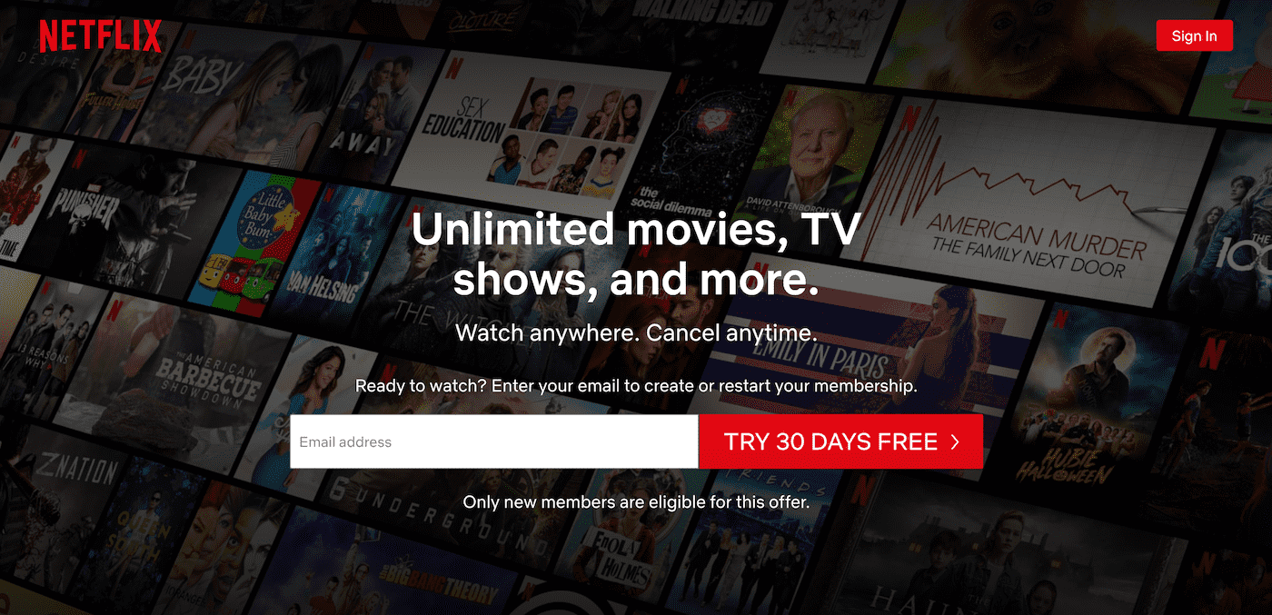
Netflix’s landing page is a masterclass in minimalism with impact:
- What Works:A clear headline, "Unlimited movies, TV shows, and more," addresses the core benefit. A single, compelling CTA ("Get started") removes decision fatigue.
- Visual Appeal:The background showcases popular shows, reminding users of the platform's vast library.
- Conversion Strategy:The user starts the journey with just an email address, eliminating friction.
- Takeaway:Keep your landing page concise and let your product’s value speak for itself.
2. Uber – Freedom And Income, Simplified
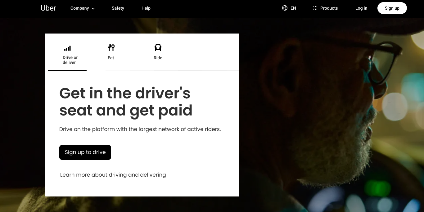
Uber’s landing page for new drivers offers a compelling promise:
- Key Features:"Get in the driver's seat and get paid" conveys flexibility and opportunity. A simple lead form with minimal fields lowers the barrier to entry.
- Targeted Copy:The language is straightforward, appealing to those looking for supplementary income.
- Images:Showcasing happy drivers creates an emotional connection.
- Takeaway:Speak to the audience's aspirations while providing a frictionless signup process.
3. CoSchedule – Organized Marketing At Your Fingertips
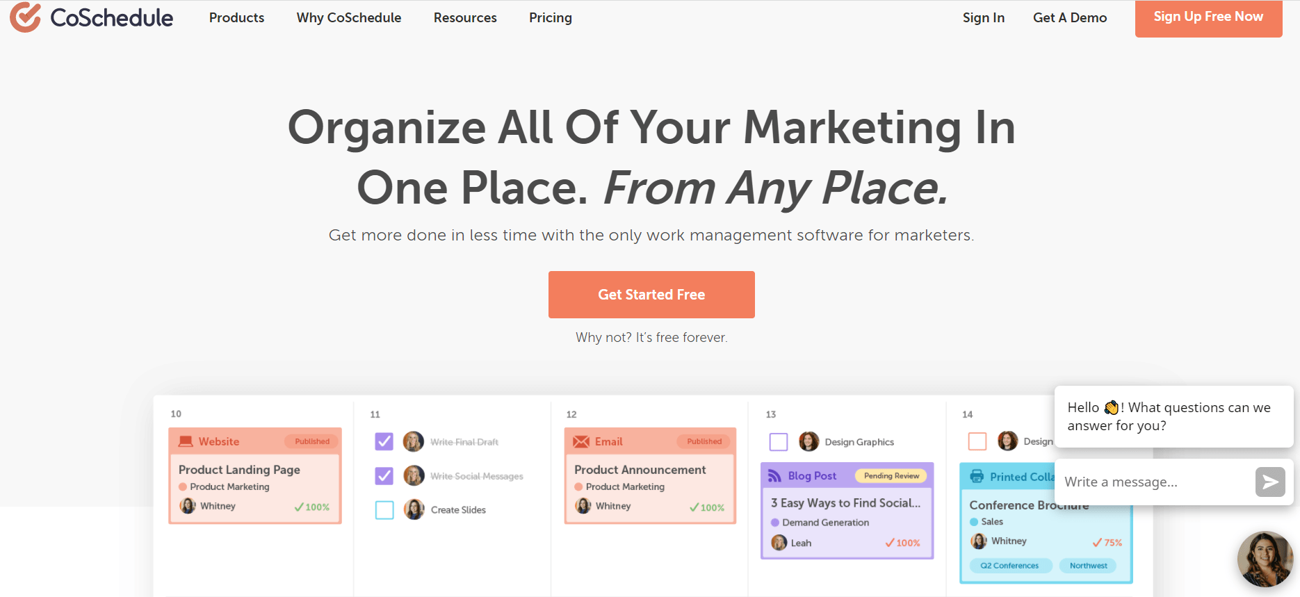
CoSchedule’s landing page addresses the pain points of marketers:
- What Stands Out:A bold headline highlights the solution: "Organize All Of Your Marketing In One Place. From Any Place."
- Urgency:Limited-time offers (e.g., discounts on subscriptions) encourage immediate action.
- Interactive Features:A dynamic video walkthrough demonstrates the tool’s value.
- Takeaway:Use targeted headlines and time-sensitive offers to captivate and convert.
4. Trello – Team Collaboration Made Effortless
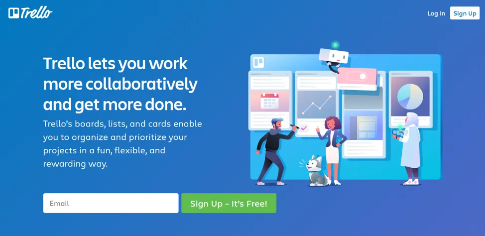
Trello’s landing page focuses on user-friendly project management:
- User-Centric Copy:Trello's landing page content reads like a conversation with a worried friend. The language highlights the difficulties you have and highlights how Trello can help you overcome them, rather than shoving the product in your face.
- Mini-Tutorials:Step-by-step visuals make the tool accessible even to technophobes.
- Design Simplicity:The page has a clean, inviting design with soft colors and easy navigation.
- Takeaway:Educate your audience with a mini-tutorial to reduce hesitation and improve conversions.
5. Spotify – Music That Moves With You
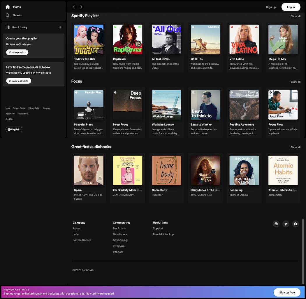
Spotify’s landing page entices users to subscribe effortlessly:
- Minimalist Approach:A single CTA, “Get Premium,” leads visitors straight to the signup page.
- Color Contrast:Vibrant hues grab attention while emphasizing benefits.
- Quick Benefit Summary:Short phrases like "Download music" and "No ads" appeal to users' pain points.
- Takeaway:Use bold colors and laser-focused benefits to create a seamless conversion experience.
6. Airbnb – Travel That Feels Like Home
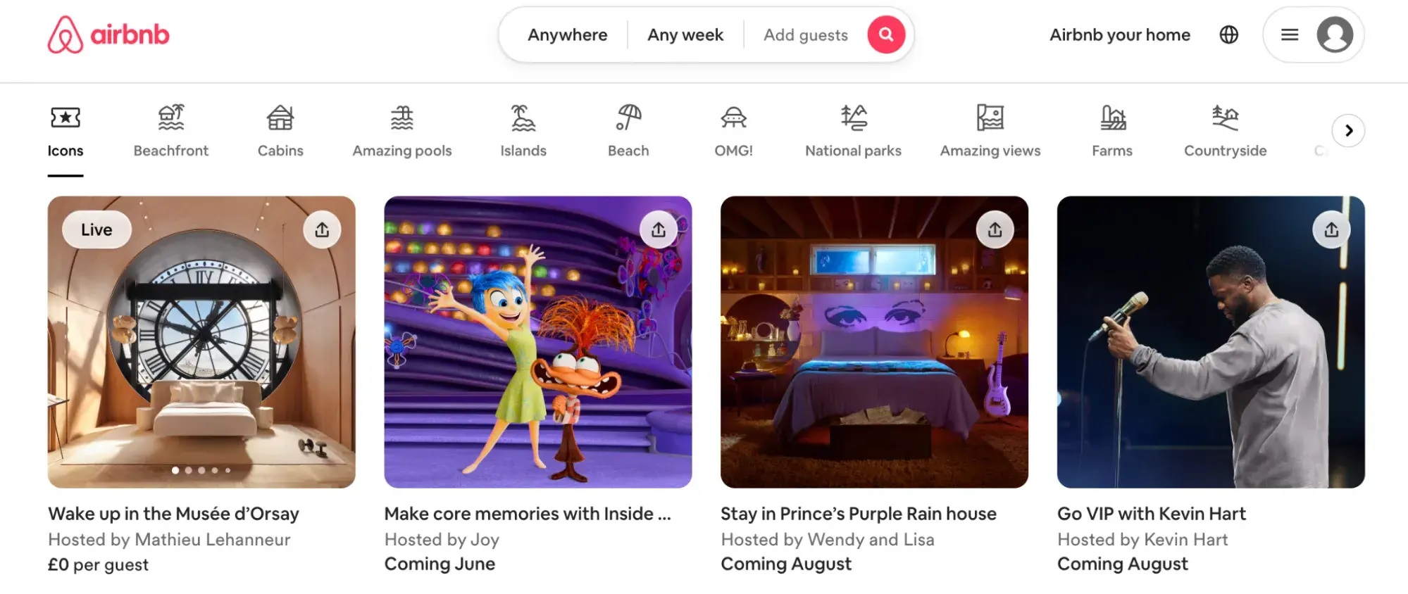
Airbnb’s landing page for hosts combines inspiration with practicality:
- Empathetic Design:It speaks to the financial empowerment and human connection of hosting.
- Trust Indicators:Reviews and safety features build credibility.
- Actionable Elements:Tools like the income calculator engage and inform prospective hosts.
- Takeaway:Address user concerns upfront while fostering a sense of community.
7. Zapier – Automation For Everyone
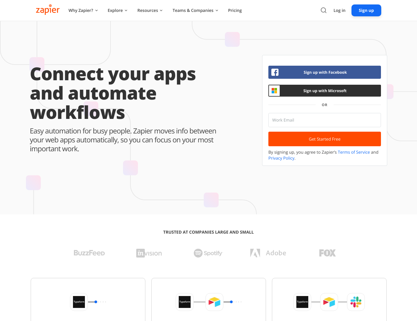
Zapier’s landing page breaks down complex automation into relatable benefits:
- Ease of Use:A search bar helps users find app connections quickly.
- Customer Stories:Real-life testimonials highlight practical applications of the tool.
- Visuals:Flowcharts demonstrate how tasks are automated, making the abstract tangible.
- Takeaway:Simplify technical concepts and show real-life use cases to connect with your audience.
8. Goby – Redefining Dental Hygiene
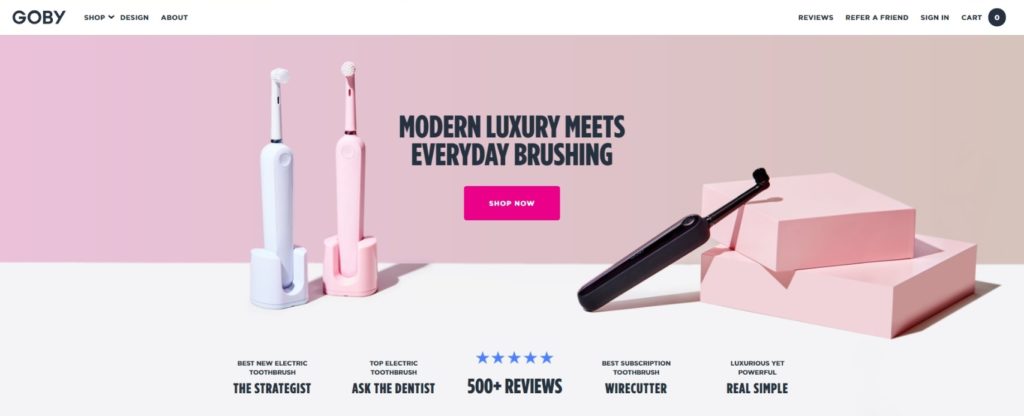
Goby’s landing page markets their electric toothbrush with a sleek approach:
- Clear Messaging:"Brushing, perfected" instantly communicates the product’s value.
- Visual Storytelling:A breakdown of product features through interactive visuals.
- Social Impact:Highlighting their donation program adds emotional resonance.
- Takeaway:Pair product details with a strong social impact story to build trust.
9. Mailchimp – Email Marketing Made Simple
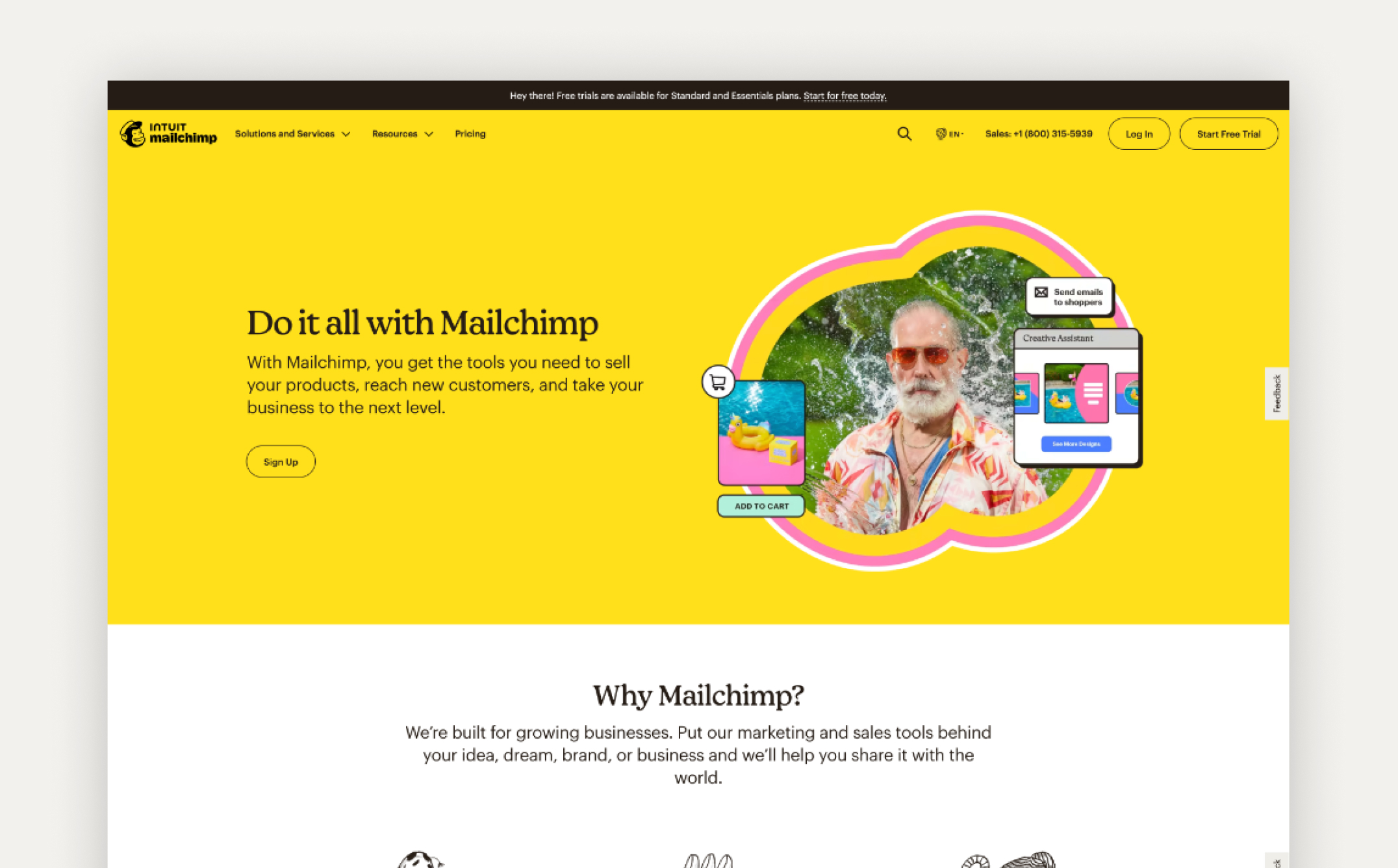
Mailchimp’s landing page emphasizes ease and effectiveness:
- Bold CTA:"Get started for free" eliminates objections with a low-risk entry point.
- Design Elements:Bright yellows and whimsical illustrations convey a friendly, approachable brand.
- Trust Markers:Showcasing customer success stories reinforces credibility.
- Takeaway:Create a warm, approachable design and emphasize a low-risk trial to attract hesitant users.
10. Whereby – Meetings Without The Hassle
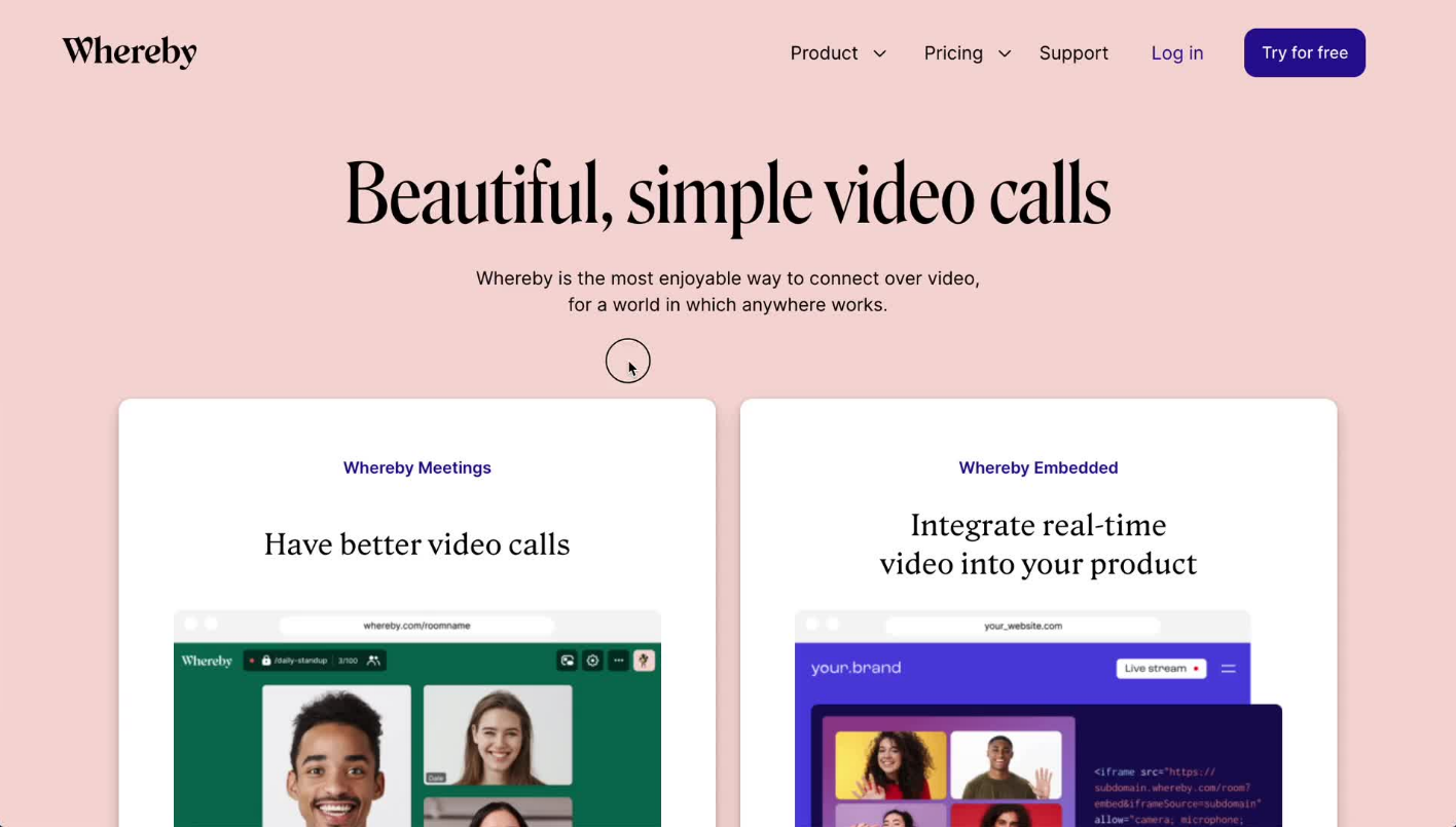
Whereby’s landing page highlights the simplicity of their video conferencing tool:
- Pain Point Addressed:Emphasizes no app downloads and quick setup times.
- Trust Signals:Featuring logos of well-known clients like Trello and GE.
- Interactive Demo:A preview of the platform encourages hands-on engagement.
- Takeaway:Remove friction points to make your value proposition irresistible.
11. Calm – Wellness Through Simplicity
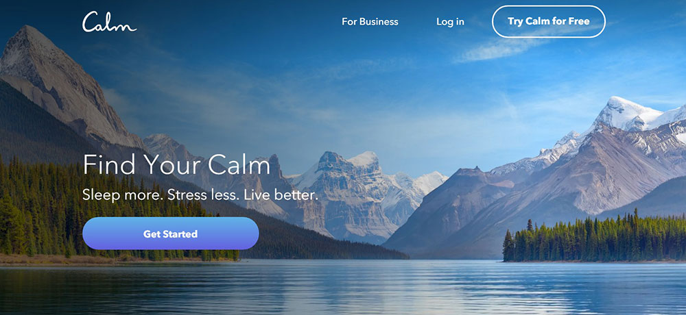
Calm’s landing page offers a serene experience, matching its meditation and sleep app:
- Visual Appeal:A soothing blue background with a sky sets a calming tone.
- Direct Messaging:The headline, “Meet Calm,” focuses on the app’s key benefits: better sleep, reduced stress, and less anxiety.
- Compelling CTA:“Start Your Free Trial” eliminates commitment hesitation.
- Takeaway:Align design and copy with your product’s purpose to resonate with your audience emotionally.
12. DoorDash – Delivering Freedom And Income
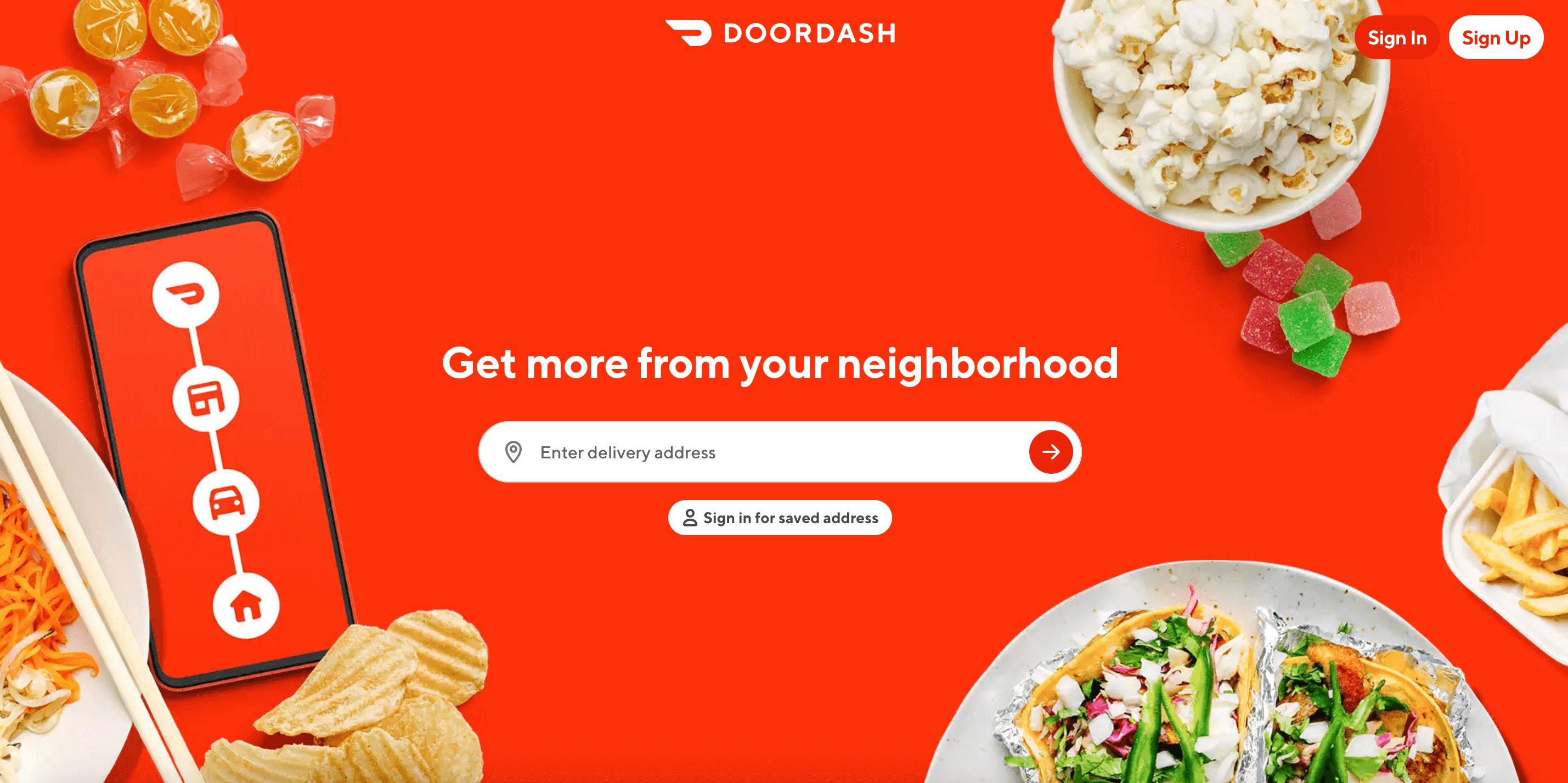
DoorDash’s landing page for new drivers highlights flexibility and earning potential:
- Customer-Centric Copy:Focuses on benefits like "Work when you want" and "Be your own boss."
- Transparent Details:Earnings estimates build trust and provide motivation.
- Design Simplicity:A few well-placed images and a clean form make signing up easy.
- Takeaway:Highlight personal benefits and transparency to build trust with your audience.
13. Campaign Monitor – Email Marketing With Impact
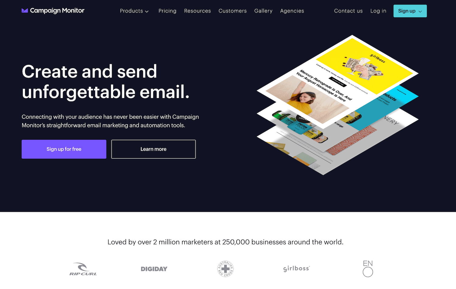
Campaign Monitor’s landing page showcases its tools in an engaging, user-friendly way:
- Focused CTA:"Design Your First HTML Email Now" provides a clear next step.
- Social Proof:Featuring customer testimonials and recognizable logos reinforces credibility.
- Interactive Features:An image carousel previews templates, allowing users to visualize their potential creations.
- Takeaway:Combine testimonials and visuals to showcase the value of your product effectively.
14. Grass Roots Farmers’ Cooperative – Ethical And Healthy Eating
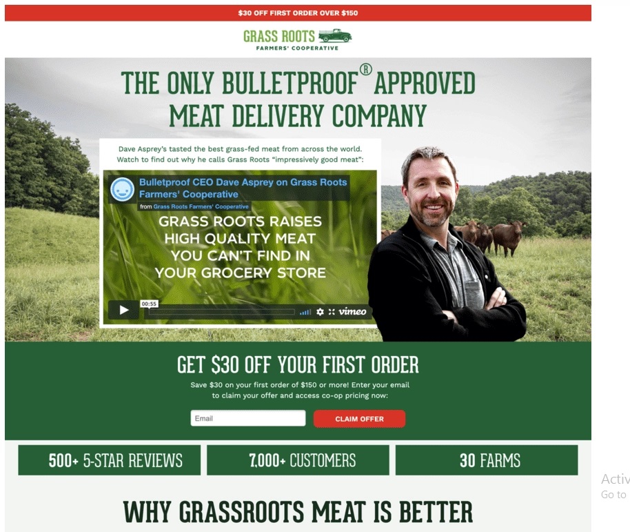
Grass Roots emphasizes their mission and quality through storytelling:
- Video Introduction:Featuring the founder, this video explains the benefits of grass-fed meat.
- Social Proof:Statistics like “7,000 happy customers” and “500 5-star reviews” build trust.
- Lifestyle Alignment:Images of farm-to-table meals highlight the brand’s commitment to health and ethics.
- Takeaway:Use storytelling and lifestyle visuals to create an emotional connection with your audience.
15. Blue Forest Farms – Hemp Reimagined
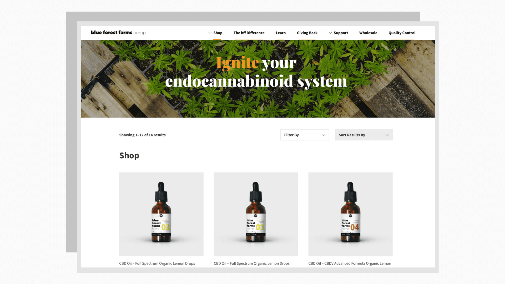
Blue Forest Farmspositions hemp oil as a refined, professional product:
- Sophisticated Design:A clean, minimal layout emphasizes quality and expertise.
- Educational Content:Sections explain the refinement process to inform and engage B2B buyers.
- Clear Forms:Simplified lead generation forms make inquiries seamless.
- Takeaway:Educate and engage your audience with detailed, accessible information.
16. CD Baby – Empowering Independent Musicians
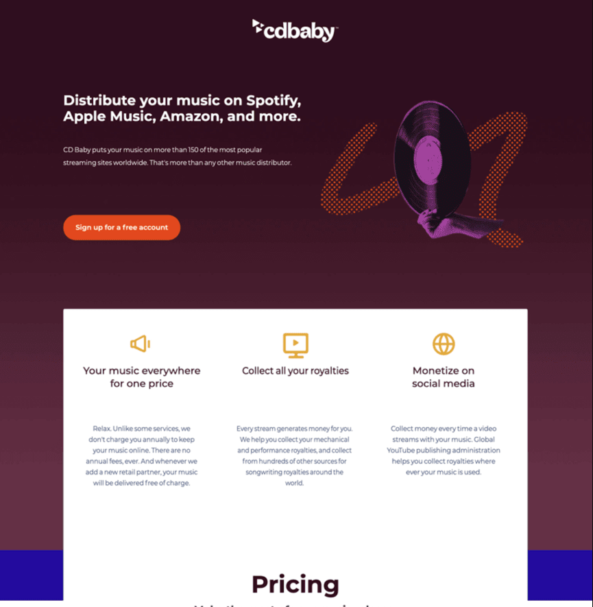
Industry:SaaS / Entertainment
Key Features:
- Lists top streaming platforms like Spotify and Amazon for trust.
- Focuses on royalties and revenue benefits for musicians.
- Features a video explaining solutions to musicians' pain points.
Takeaway:Use direct benefits and video content to appeal to niche creators.
17. Zola – Simplifying Wedding Planning
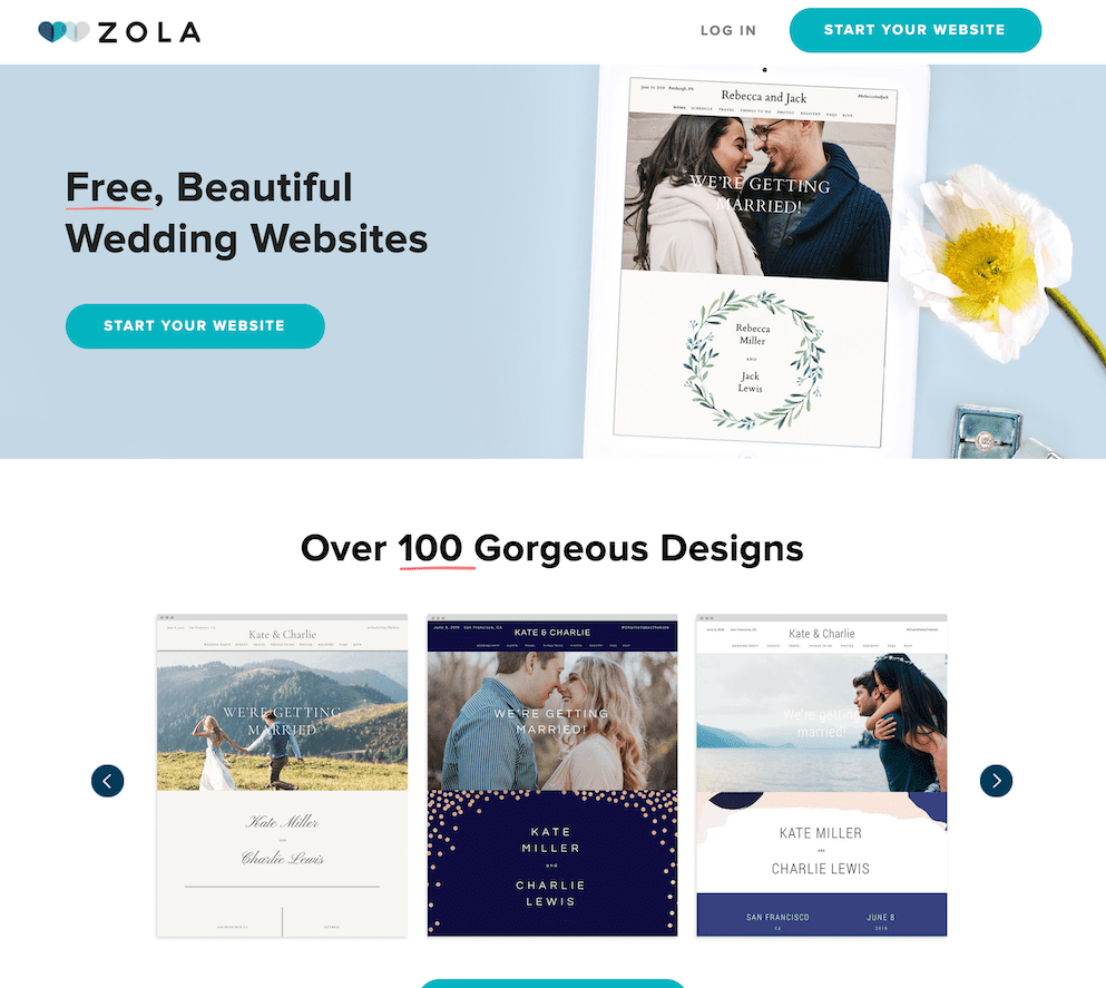
Zola’s landing page makes wedding planning stress-free:
- Value Proposition:Free website templates and discounts on save-the-dates grab attention.
- Professional Imagery:Real wedding photos showcase the platform’s potential.
- Bundled Offers:Encouraging users to pair multiple services increases value perception.
- Takeaway:Offer bundled solutions to encourage broader engagement with your platform.
18. SEMrush – Spying On Your Competitors
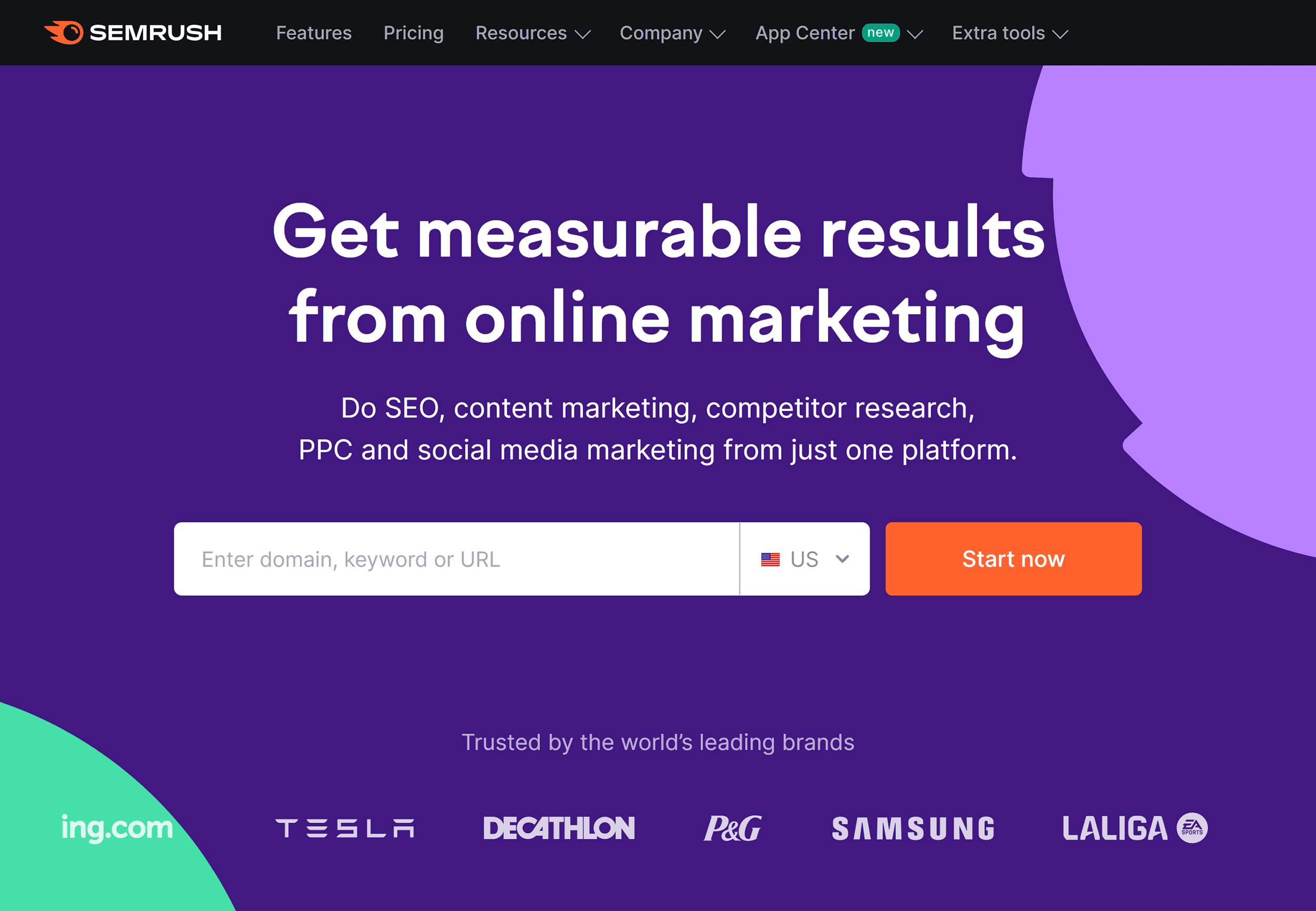
SEMrush’s landing page offers a compelling call-to-action:
- Interactive Form:Visitors can instantly analyze a competitor’s domain.
- Strong Social Proof:Awards, logos, and testimonials underscore credibility.
- Audience-Driven Content:Appeals to data-driven marketers with detailed insights.
- Takeaway:Provide instant value to engage users quickly.
19. Snappr – Picture-Perfect Simplicity
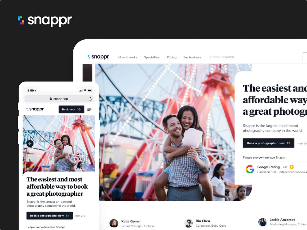
Snappr’s landing page connects users with photographers effortlessly:
- Streamlined Process:A three-step guide outlines how the platform works.
- Trust Signals:Logos of Fortune 500 companies and high ratings add credibility.
- User Segmentation:Categories like "weddings" and "real estate" tailor the experience.
- Takeaway:Simplify the user journey with clear steps and targeted categories.
20. Perfect Keto – Healthy And Delicious
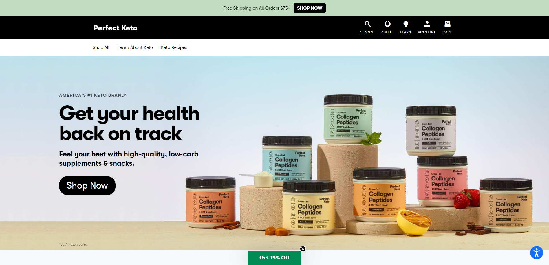
Perfect Keto’s landing page highlights benefits and credibility:
- Nutrition Transparency:Close-ups of nutritional labels cater to health-conscious buyers.
- Use Cases:Suggestions for when to enjoy the product (e.g., post-workout) add practicality.
- Influencer Endorsements:Testimonials from respected fitness figures bolster trust.
- Takeaway:Leverage transparency and endorsements to build authority in health-focused niches.
21. Branch Furniture – Office Design Made Easy
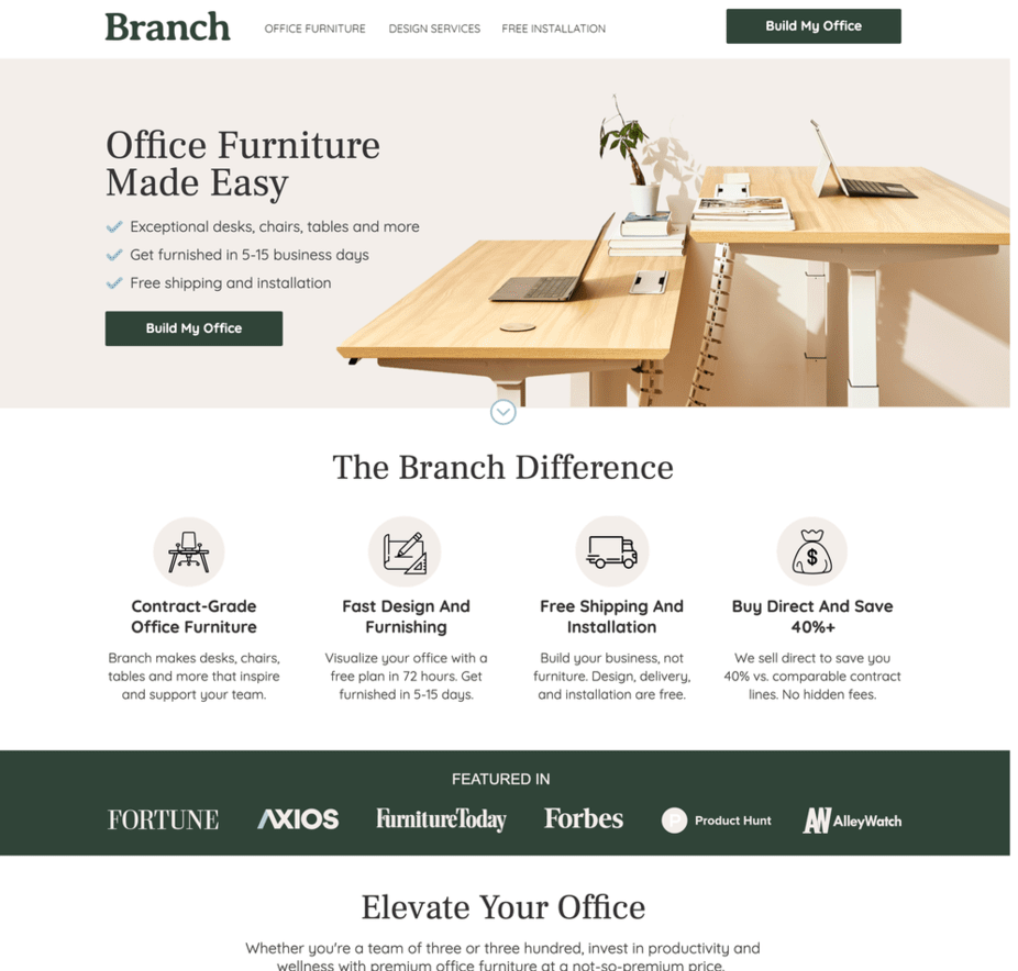
Branch Furniture’s landing page makes office furnishing straightforward:
- Powerful Headline:"Office Furniture Made Easy" communicates value immediately.
- Clever CTAs:Phrases like "Design My Office" align with the user journey.
- Expert Assistance:Highlighting free design consultations fosters trust.
- Takeaway:Simplify complex decisions with clear options and helpful guidance.
22. Western Rise – Elevated Everyday Clothing
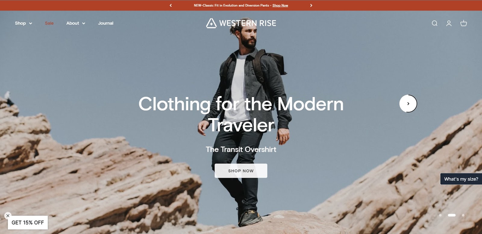
Western Rise’s page for its AT Slim Rivet Pants stands out:
- Visual Appeal:Striking full-width photos highlight product quality.
- Benefit-Driven Copy:Positions the pants as versatile, durable, and stylish.
- Technical Details:Clear “Tech Specs” section appeals to practical buyers.
- Takeaway:Emphasize product benefits and technical features for informed decision-making.
23. Athabasca University – Flexible Learning
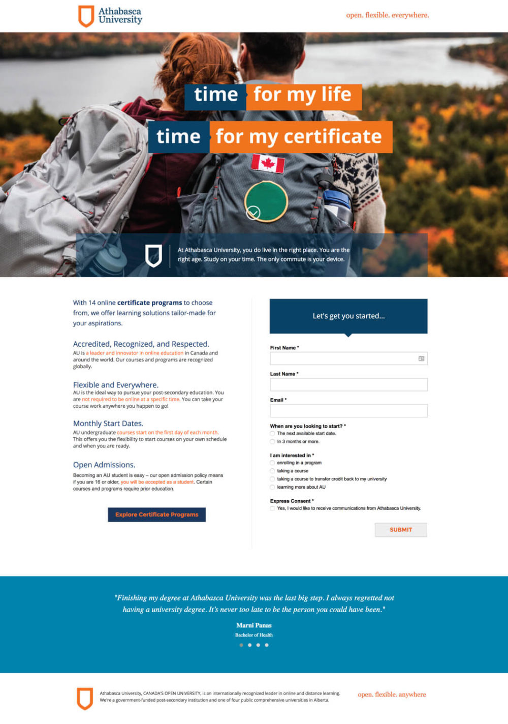
Athabasca University uses its landing page to promote online education:
- Audience-Specific Copy:Targets busy adults seeking flexible options.
- Trust-Building Testimonials:Real-life success stories inspire confidence.
- Strategic Design:A Z-pattern layout directs attention to key elements.
- Takeaway:Address specific audience pain points with relatable, inspiring content.
24. Fast Mask – Adventure-Ready Bandanas
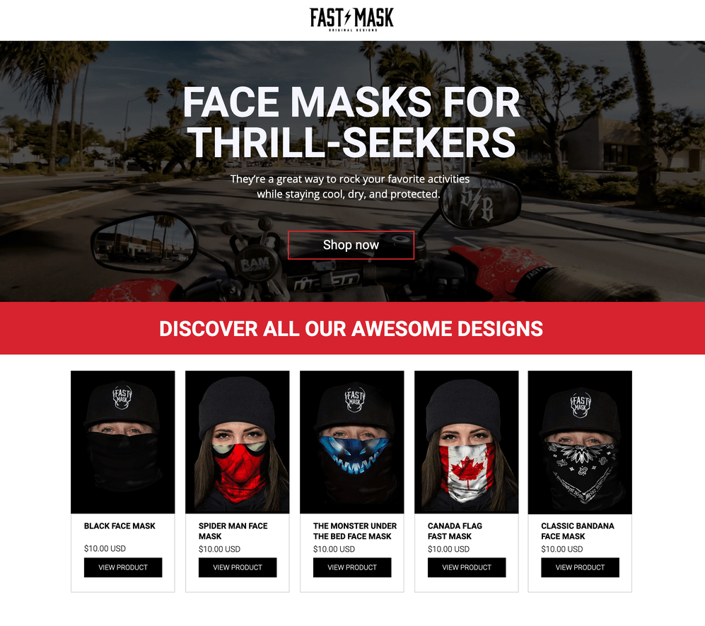
Fast Mask’s page connects with thrill-seekers:
- Dynamic Imagery:Vibrant photos of extreme sports create excitement.
- Best-Sellers Highlighted:Showcasing popular designs aids decision-making.
- Targeted Copy:Appeals to adventure enthusiasts with relatable language.
- Takeaway:Cater to niche audiences by aligning visuals and messaging with their lifestyle.
25. Mooala – Simplified Dairy Alternatives
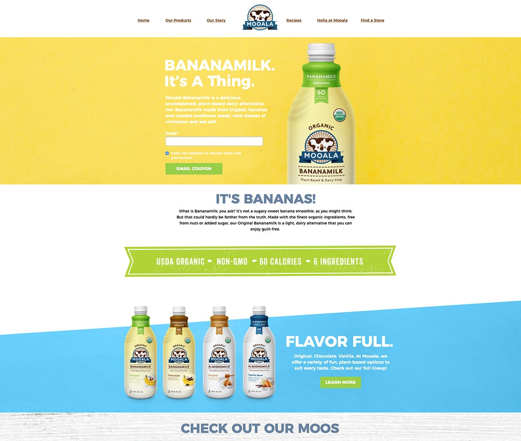
Mooala’s landing page for its Bananamilk is refreshingly clear:
- User-Focused Copy:Reassures visitors with explanations of what the product is-and isn’t.
- Interactive Features:Coupons encourage immediate action.
- Brand Alignment:Playful visuals reflect the product’s fun personality.
- Takeaway:Use engaging visuals and playful copy to reflect your brand’s identity.
26. Bouquet Bar – Gifts For Any Occasion
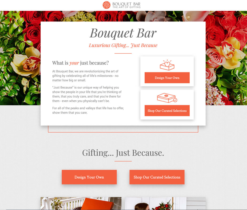
Bouquet Bar’s landing page is a feast for the eyes:
- Customizable Options:Offers tools to design your bouquet, engaging visitors.
- Evocative Photography:Images of recipients enhance emotional appeal.
- Social Proof:Customer testimonials and user-generated photos add credibility.
- Takeaway:Let visitors personalize their experience to boost engagement.
27. Wavehuggers – Surf Lessons Simplified
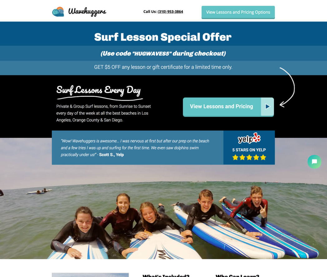
Wavehuggers combines safety and fun in its landing page:
- Urgency Triggers:Limited-time promotions encourage quick bookings.
- Real Photos:Candid images of learners build trust and relatability.
- Safety Assurance:Highlights instructor credentials to reduce hesitations.
- Takeaway:Address safety concerns and use authentic visuals to connect with your audience.
28. Border Buddy – Simplified Customs Solutions
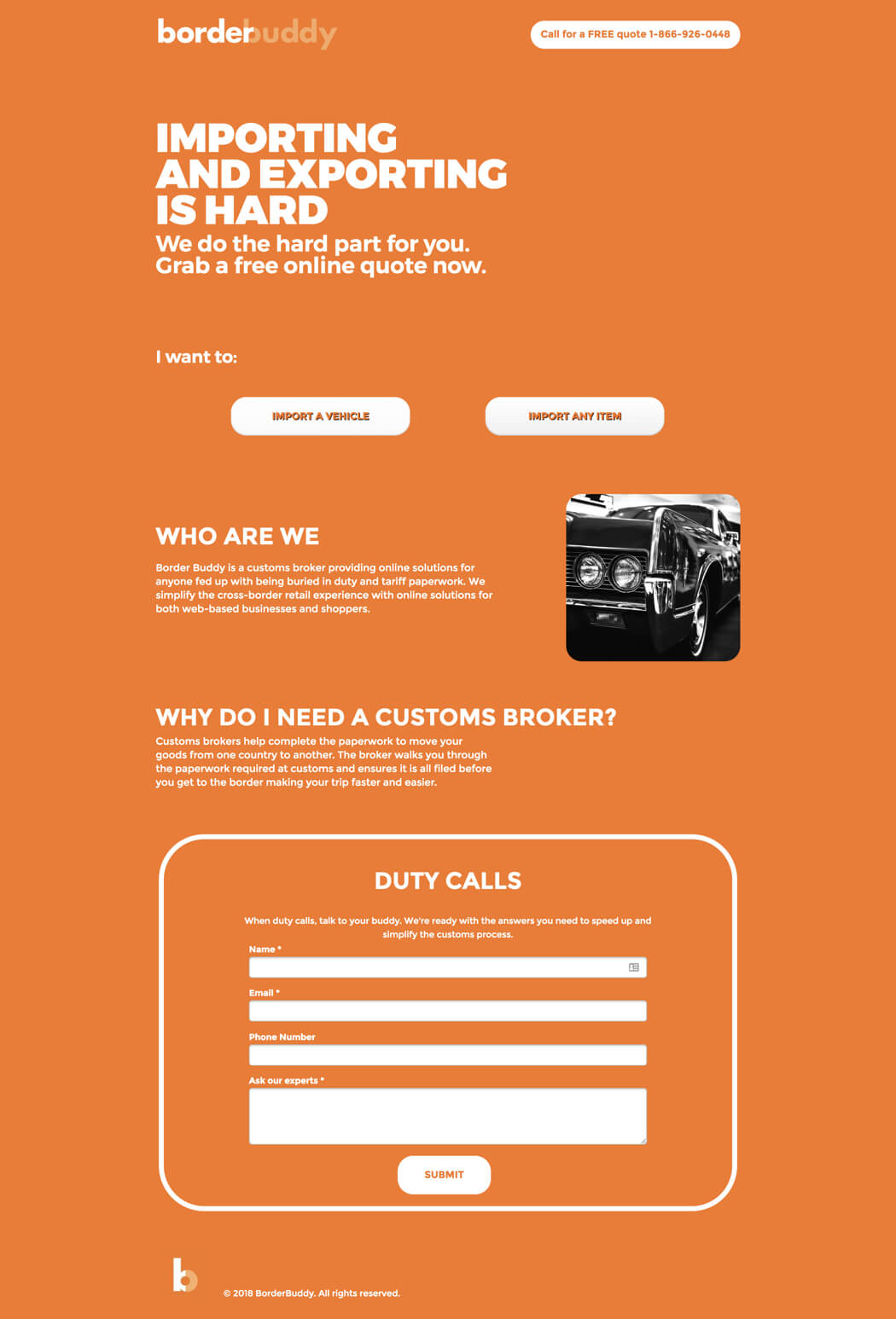
- What Works: A bold headline, "Importing and Exporting Is Hard," addresses a common pain point. The CTA, "Get Your Quote," encourages immediate action.
- Visual Appeal: Clean, professional design with trust badges reinforces reliability.
- Conversion Strategy: A short form reduces friction and engages users quickly.
Takeaway: Address specific pain points and provide clear next steps to build trust and drive conversions.
29. Class Creator – School Solutions Made Simple
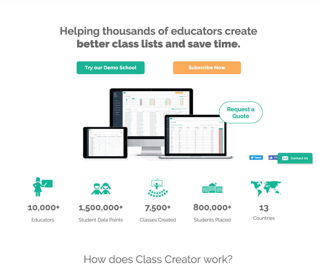
Class Creator’s landing page efficiently targets education decision-makers:
- Social Proof:Statistics like “10,000+ educators” build credibility.
- Streamlined Forms:Multi-step forms reduce psychological friction.
- Benefit-Focused Copy:Highlights efficiency in solving school challenges.
- Takeaway:Present clear, focused solutions for specific industries to drive conversions.
30. Good Eggs – Grocery Delivery Reimagined
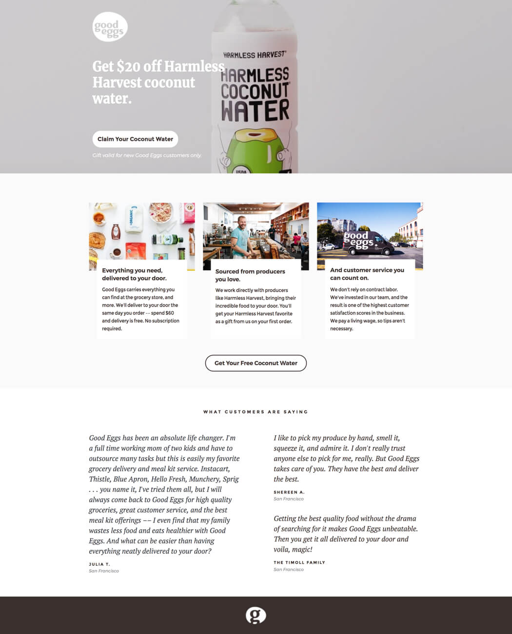
Good Eggs’ page showcases its fresh food delivery service:
- Emotional Connection:Promotes sustainability and ethical sourcing.
- Exclusive Offers:Free coconut water draws in potential customers.
- Persuasive Testimonials:Carefully selected quotes emphasize quality and ease.
- Takeaway:Use limited-time offers and emphasize ethical practices to appeal to conscientious buyers.
31. Zumba – Instructor Training Made Fun
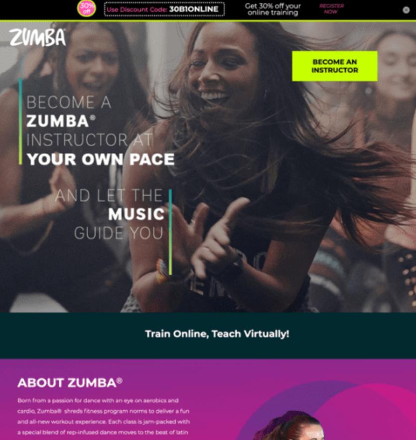
Zumba’s landing page invites users to join a dynamic fitness movement:
- Active Imagery:Showcases real instructors in action, radiating energy.
- Inspiring Copy:Uses motivational language like "thrive as an instructor."
- Video Content:Offers an engaging preview of instructor training programs.
- Takeaway:Match the tone and energy of your audience’s aspirations.
32. Jet Pet – Luxury Pet Care
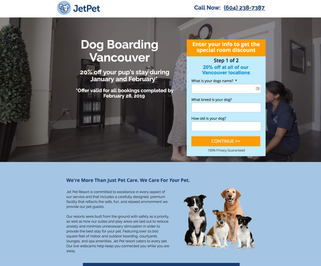
- Key Features: Highlights "Your pet deserves the best" and “Dog Boarding Vancouver” to appeal to pet owners’ emotions. The CTA, "Book a Stay," is clear and actionable.
- Visual Appeal: High-quality images of happy pets create an emotional connection.
- Trust Signals: Testimonials and certifications reassure pet owners of their decision.
Takeaway: Use emotional appeal and trust signals to connect with your audience and encourage action.
33. Snackpass – Social Commerce For Snacks

Snackpasscreates buzz for quick-serve restaurants:
- Social Media Integration:Highlights TikTok and Instagram feeds.
- On-Brand Visuals:Use of playful, food-themed graphics aligns with audience tastes.
- In-The-News Section:Credibility boosted by media mentions.
- Takeaway:Integrate social media to align with a trendy, youthful audience.
34. Panda7 – Insurance Redefined
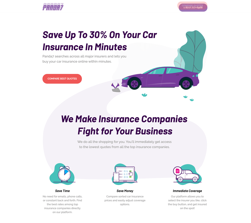
- What Works: A headline like "Insurance simplified" removes complexity for users. The CTA, "Get Your Quote," is straightforward and immediate.
- Design: Clean layout with animated elements keeps users engaged.
- Benefits: Clear bullet points outline why Panda7 stands out in the insurance market.
Takeaway: Simplify complex offerings with clear benefits and engaging design to keep users focused.
35. Pared – Connecting Hospitality Professionals
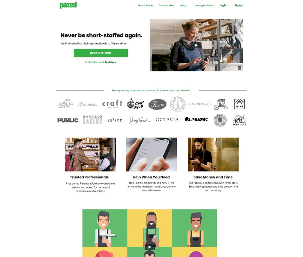
- Key Features: A headline like "Work on your terms" speaks directly to hospitality workers’ needs. The CTA, "Join Now," encourages signups.
- Visual Appeal: Photos of real users working in hospitality settings add authenticity.
- Trust Signals: Partner logos and user testimonials build credibility.
Takeaway: Speak directly to your audience’s needs with authentic visuals and clear CTAs.
36. Miro – Creative Remote Collaboration
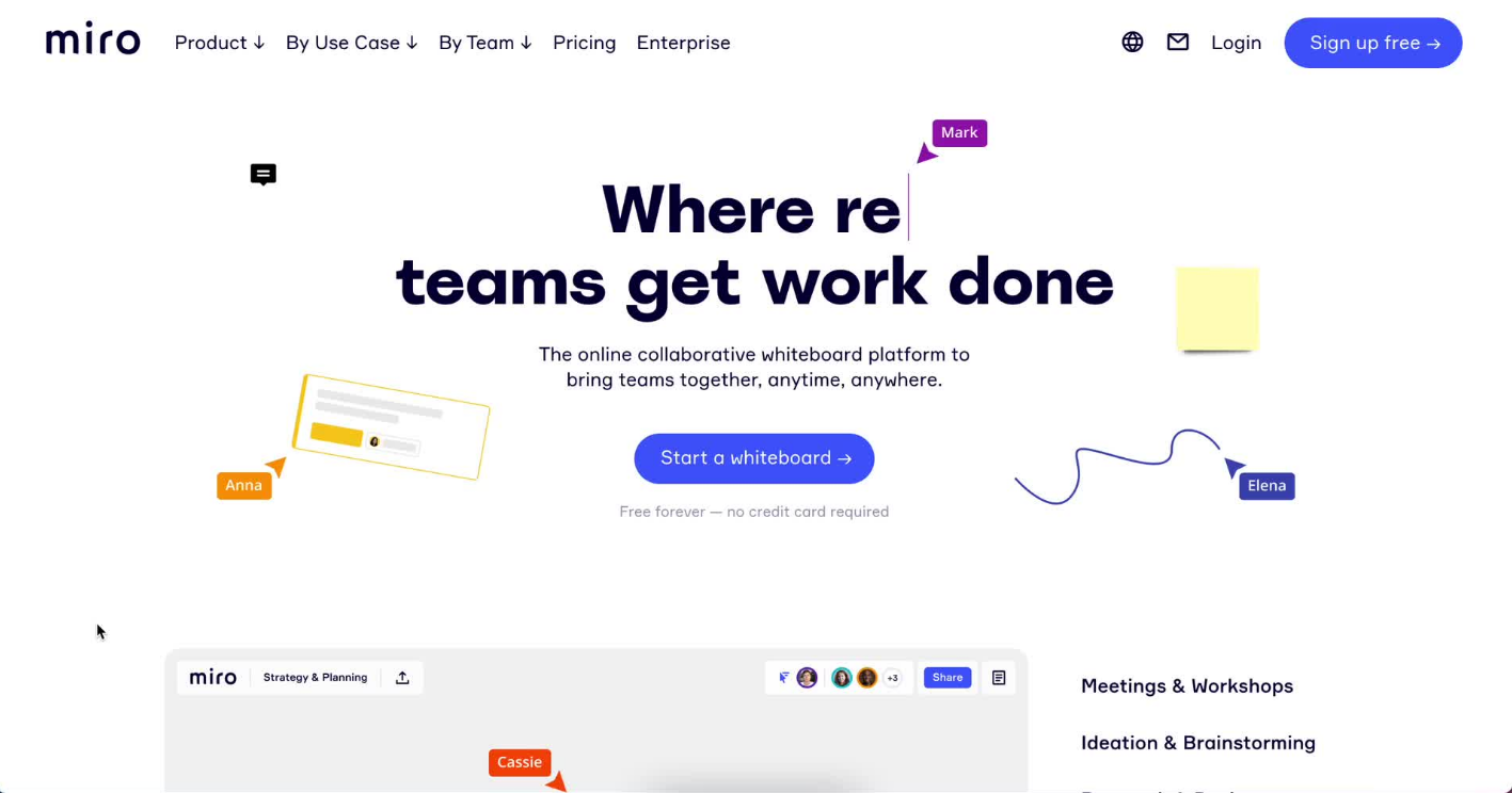
Miro supports team brainstorming with a feature-rich landing page:
- Dynamic Headline:Speaks directly to remote teams and their needs.
- Use Case Focus:Explains common scenarios like workshops or project planning.
- Customer Logos:Promotes trust with well-known client names.
- Takeaway:Highlight diverse applications for software products to widen appeal.
37. Woolx – Premium Outdoor Clothing
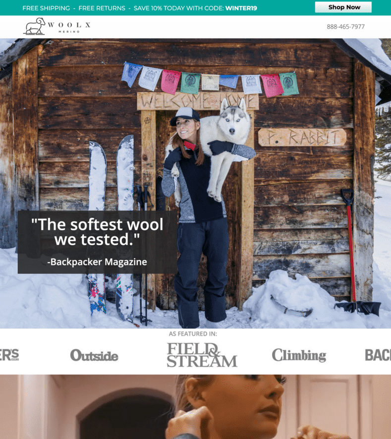
- What Works: Highlights "Stay warm, stay dry" to immediately convey product benefits. The CTA, "Shop Now," directs users to the product catalog.
- Visual Appeal: High-quality product imagery emphasizes comfort and durability.
- Content: Sections like "Why Woolx?" educate users about unique features.
Takeaway: Combine high-quality visuals with educational content to engage informed buyers.
38. LinkedIn – Professional Networking Made Easy
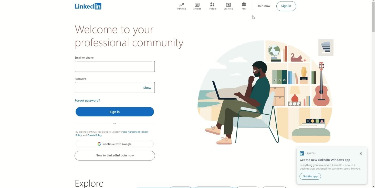
- Key Features: "Connect with opportunities" highlights the platform’s value proposition. The CTA, "Join Now," removes barriers for new users.
- Visual Appeal: Images of diverse professionals reinforce inclusivity and opportunity.
- Benefits: Outlines clear advantages, such as career growth and networking.
Takeaway: LinkedInhighlight user benefits and create an inclusive design to attract a broad audience.
39. SEO Blueprint – Simplifying Search Optimization
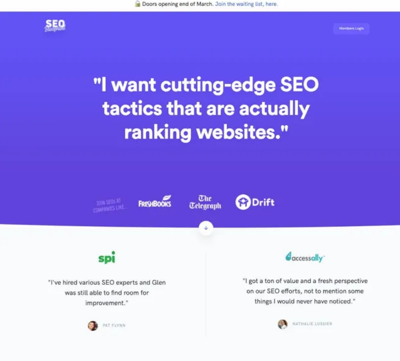
SEO Blueprint connects with marketers looking for guidance:
- Relatable Headline:Speaks directly to common SEO frustrations.
- Exclusive Access:Creates urgency with a waitlist for limited availability.
- Authority-Boosting Testimonials:Features endorsements from SEO professionals.
- Takeaway:Create exclusivity to drive interest in niche courses or products.
40. Twinwoods Adventure – Indoor Skydiving Thrills
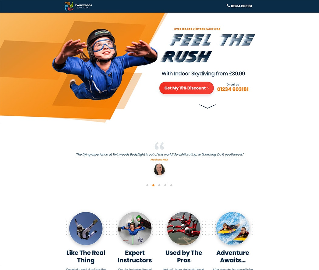
Twinwoods Adventure immerses visitors in excitement:
- Action-Packed Visuals:Photos and videos of indoor skydiving in action.
- Urgency Triggers:Limited-time offers encourage immediate bookings.
- Trust Elements:High review scores from platforms like TripAdvisor.
- Takeaway:Use high-energy visuals and urgency to connect with adventurous audiences.
41. Amazon – Effortless Shopping
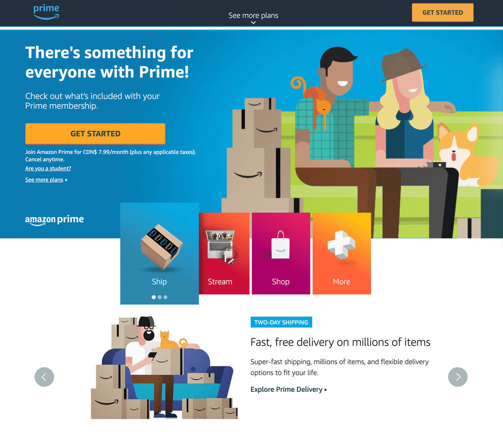
- What Works: Focused messaging like "Find what you need" aligns with user intent. The CTA, "Start Shopping," is immediate and clear.
- Personalization: Dynamic recommendations based on user preferences keep users engaged.
- Trust Signals: Reviews, ratings, and fast delivery options build confidence.
Takeaway: Use personalization and trust signals to create a seamless and reliable shopping experience.
42. Roomeze – Simplifying Roommate Searches
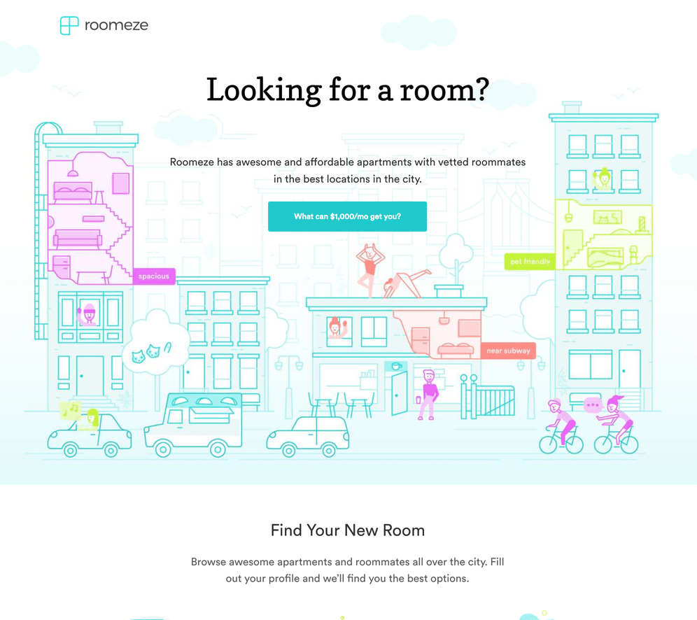
Roomeze addresses shared housing needs with a vibrant design:
- Eye-Catching Graphics:Fun, playful visuals attract younger audiences.
- Compelling Headline:Frames a shared apartment as affordable luxury.
- Segmented Journey:Tailors the search experience for different user needs.
- Takeaway:Cater to audience demographics with relatable language and visuals.
43. Blow LTD. – On-Demand Beauty Services
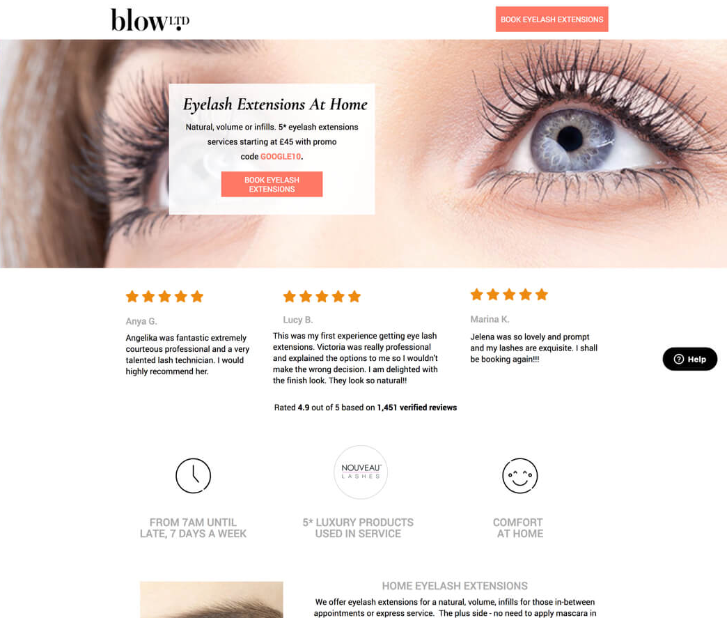
- What Works: A headline like "Beauty at your doorstep" directly appeals to busy users. The CTA, "Book Now," emphasizes immediacy.
- Visual Appeal: High-quality images of professional beauty services create trust and desirability.
- Convenience Focus: The page highlights benefits like same-day service and easy booking.
Takeaway: Focus on convenience and high-quality visuals to attract busy, service-oriented users.
44. HomeLoanGurus – Simplified Mortgage Solutions
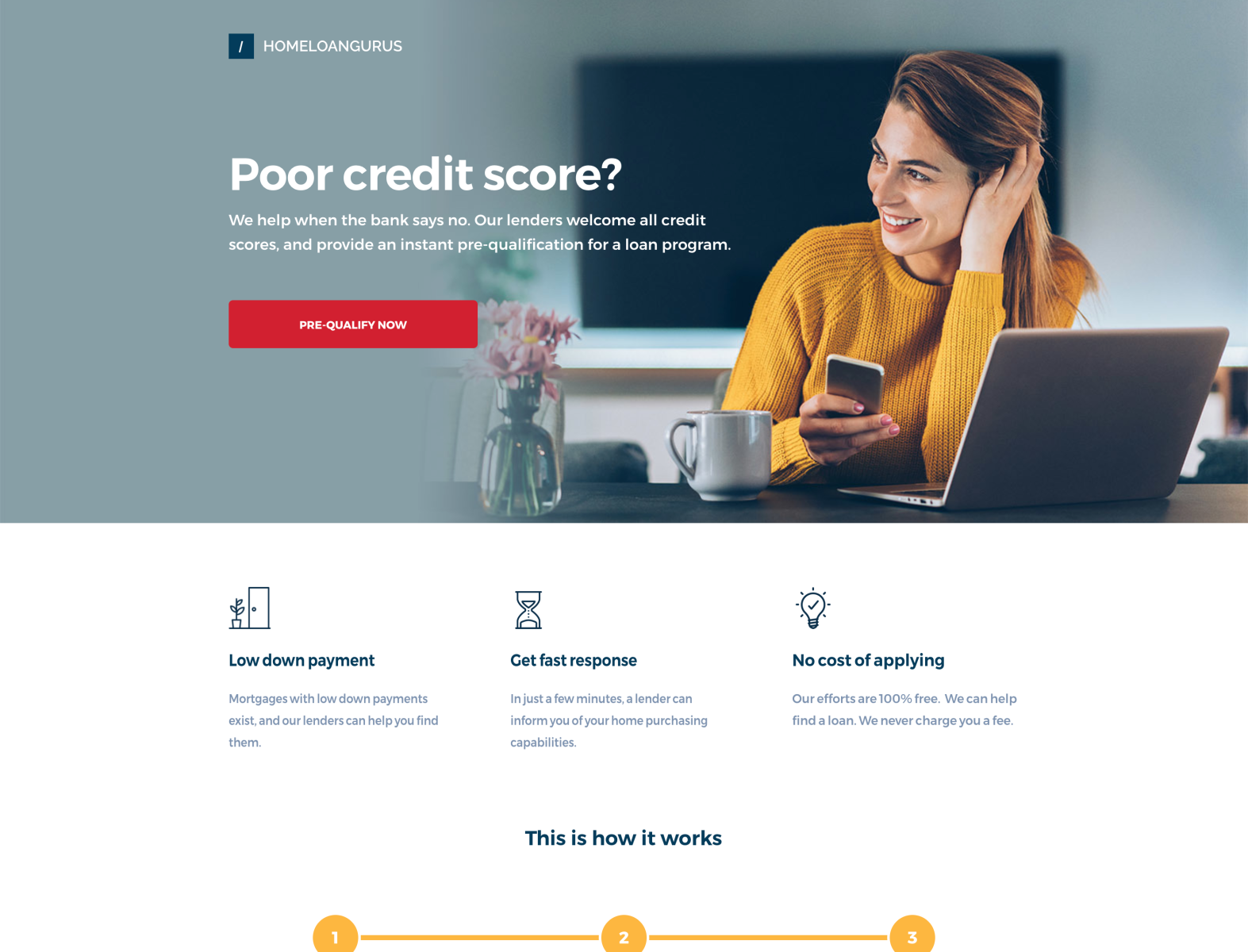
- Key Features: A headline like "Your home loan, made easy" addresses common financial stress. The CTA, "Get Started," removes barriers to engagement.
- Content: Clear explanations of loan types and benefits guide users through the process.
- Trust Signals: Partner logos and customer testimonials build credibility.
Takeaway: Simplify complex financial processes with clear content and trust-building elements.
45. Bariatric Eating – Support For Post-Surgery Nutrition
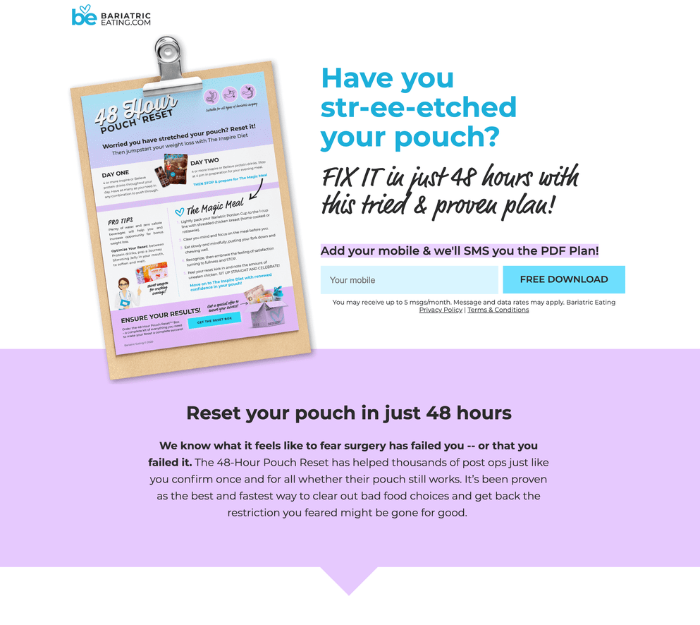
- What Works: A headline like "Nutrition made easy for your journey" addresses a specific audience’s needs. The CTA, "Shop Now," is direct and actionable.
- Educational Content: Sections explaining the importance of tailored nutrition build authority.
- Visual Appeal: Images of products and success stories create an emotional connection.
Takeaway: Use educational content and emotional connections to engage niche audiences effectively.
Also Read: 15 Best Landing Page Builders In <year> [Top Picks For Success]
FAQs About Landing Pages
What Are The Key Elements Of A High-converting Landing Page?
A high-converting landing page includes a clear headline, engaging visuals, concise copy, a strong CTA, trust signals, and an optimized layout to focus on user intent.
How Can I Test The Effectiveness Of My Landing Page?
Use tools like Google Optimize or A/B testing platforms to experiment with different headlines, CTAs, or layouts. Track conversion rates to measure success.
Are Landing Pages Only For E-commerce?
No, landing pages can be used across industries, from SaaS companies to nonprofits, to drive specific user actions like signups, downloads, or inquiries.
What Tools Can I Use To Create A Landing Page?
Popular tools include Unbounce, Leadpages, Instapage, and HubSpot. These platforms offer drag-and-drop functionality for quick and easy setup.
How Many CTAs Should A Landing Page Have?
Ideally, a landing page should have one primary CTA to minimize distractions and focus the user’s attention.
Conclusion
A great landing page isn’t just visually appealing; it’s a carefully designed tool that meets user needs and encourages specific actions. Whether you’re promoting a subscription service like Netflix or simplifying automation like Zapier, the principles of clarity, focus, and trustworthiness are universal. By analyzing these examples and applying their strategies, you can create landing pages that not only look great but also deliver results.
Remember, the key to success lies in constant testing and iteration. The best landing pages evolve based on user feedback and performance metrics. Start implementing these insights today and watch your conversions soar.